Отдельная кухня – фото дизайна интерьера
Сортировать:
Бюджет
Сортировать:Популярное за сегодня
1 - 20 из 143 725 фото
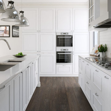
Идея дизайна: параллельная, отдельная кухня в современном стиле с врезной мойкой, белым фартуком, фасадами в стиле шейкер, коричневыми фасадами, бежевым полом и коричневой столешницей
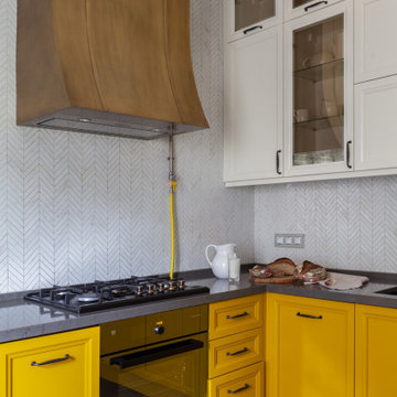
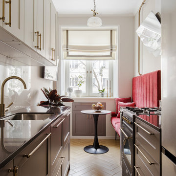
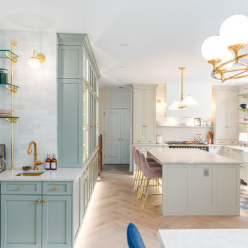
Стильный дизайн: маленькая отдельная, п-образная, глянцевая кухня в классическом стиле с врезной мойкой, фасадами с выступающей филенкой, желтыми фасадами, столешницей из кварцевого агломерата, белым фартуком, фартуком из плитки мозаики, цветной техникой, полом из керамогранита, коричневым полом, коричневой столешницей, кессонным потолком, двухцветным гарнитуром, окном и красивой плиткой для на участке и в саду - последний тренд
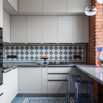
Однокомнатная квартира в тихом переулке центра Москвы.
Среди встроенной техники - стиральная машина с функцией сушки, СВЧ, холодильник, компактная варочная панель.
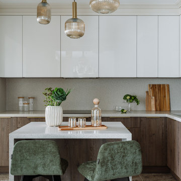
Фото: Шангина Ольга
Стиль: Рябова Ольга
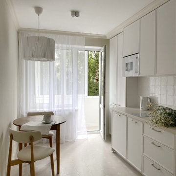
Пример оригинального дизайна: отдельная, угловая кухня среднего размера в современном стиле с врезной мойкой, плоскими фасадами, белыми фасадами, столешницей из акрилового камня, бежевым фартуком, полом из керамической плитки, островом, бежевым полом и бежевой столешницей
Пример оригинального дизайна: отдельная, угловая кухня среднего размера в современном стиле с врезной мойкой, плоскими фасадами, белыми фасадами, столешницей из акрилового камня, бежевым фартуком, полом из керамической плитки, островом, бежевым полом и бежевой столешницей
Идея дизайна: отдельная, п-образная кухня среднего размера в стиле рустика с зелеными фасадами, белым фартуком, фартуком из каменной плиты, техникой из нержавеющей стали, полом из керамогранита, белой столешницей, деревянным потолком, мойкой у окна, с полувстраиваемой мойкой (с передним бортиком), фасадами с утопленной филенкой и коричневым полом
Артистический интерьер для яркой пары.
Общие параметры:
Тип недвижимости: Квартира в доме 1956 года.
Где находится (если не секрет): Москва, Соколиная Гора
Метраж: 80 м2
Стиль (как бы вы его сами определили): Артистический интерьер
Основная идея проекта: создать яркое артистичное пространство с множеством деталей, подчеркивающее характер его владельцев.
Цветовая гамма: смешанная гамма, композиция теплых и холодных оттенков.
1. Особенности планировки.
В квартире имеется спальня с эркером, гостиная и отдельная кухня. До перепланировки помещения были мало освещенными и тесными. За счёт объединения гостиной и кухни, а также цветовой палитры удалось создать достаточно светлый, жизнерадостный интерьер.
Кухню с подведенным газом, как и требуют правила, отделили от гостиной герметичной перегородкой.
В квартире присутствует помещение, в котором находится законсервированный мусоропровод, который не удалось удалить, без согласования всех жильцов дома, а их, к слову, оказалось не мало (в 135 квартирах). В итоге в этой комнате расположился гардероб и дополнительные места для хранения.
Прихожая продолжается длинным коридором, имеющим большой шкаф с множеством мест для хранения одежды и костюмов, которые наши герои создают для музыкальных фестивалей. С противоположной стороны расположен вход в спальню
2. Если можно, пару слов о заказчиках. Основные пожелания заказчиков.
Владельцы квартиры – творческие и неординарные молодые люди, приобрели себе квартиру площадью 80 м2 в доме 1956 года, которая отчаянно требовала ремонта.
Ребята круто играют на гитарах, ежегодно участвуют в музыкальных фестивалях и фестивалях Burning Man, а еще успешно занимаются созданием световых инсталляций. Заказчики в первую очередь хотели создать необычное пространство, которое вдохновляло бы их на творческие порывы и отражало их внутренние миры.
3. Какие декораторские и архитектурные приемы вы использовали в оформлении этого интерьера.
Особую атмосферу при входе в спальню создают парадные двустворчатые двери, которые привносят особую эстетику и дополняют образ спальни.
Пол и фартук в кухне декорированы орнаментом английской плитки, которая напоминает советскую.
Спальня светлая, свежая и яркая, как и ее обитатели. Цветовая гамма - чистые ясные оттенки голубого и синего.
В изголовье кровати Обои с узором по мотивам керамики местечка Кап-д’Ай, что на юго-востоке Франции, который символизирует слияние неба и земли на растительном фоне, как слияние мужского и женского.
Растительный мотив поддерживает кровать и тумбы из природных материалов.
Интерьер наполнен предметами искусства, которые придали пространству лёгкие ироничные нотки.
Чтобы шкаф в гостиной не выглядел просто шкафом, на его фасадах мы расположили печатную графику и декор, теперь он напоминает больше стеновые панели, нежели гардероб.
4. У меня в голове возникла история. Жизнь, как игра, она жонглирует разными событиями, ситуациями, а мы всегда учимся поймать и отреагировать на то или иное. Весь интерьер, как заказчики - активный и наполнен адреналином. В интерьере много цветного стекла, совсем как шарики жонглера, а скульптура Льва Ефимова (синие пенящиеся шары) словно символ пойманных и сложенных воедино пойманных моментов и впечатлений. Литография на стене — это ещё один символ легкости бытия и позитивного отношения к жизни. Дизайнерские светильники в гостиной — это отражение легкости мысли. А скульптура в спальне на подоконнике, говорит о течении времени и каждый раз просыпаясь утром, возникает понимание, что жизнь течёт и нужно наслаждаться ей и стремиться сделать много нового и с любовью, нового и вместе. «Вместе» — это о литографии в прихожей «Поцелуй». Эта работа, с входа в квартиру говорит о гармонии и ярких отношениях пары, а скульптура на консоли из стекла вторит этой работе, красное и голубое стекло сплелось в единую композицию. На мой взгляд - эти две работы из разных эпох, а словно созданы друг для друга.
5. Самым важным в этом проекте было вдохнуть вторую жизнь в обветшалое и сало похожее на жилище пространство. Впервые попав на объект, мы даже не знали за что схватиться первым делом. Задачи были повсюду, начиная от мусоропровода в середине квартиры и заканчивая стенами, которые были в шатком состоянии.
6. В каждом помещении есть акценты и образующие интерьер конструкции, например в кухне-гостиной это перегородка из стекла, которая выглядит легко, но в то же время зонирует пространство. В спальне акцент на эркер, это первое что понравилось в квартире, когда мы зашли, много света из окон большой плюс особенно зимой.
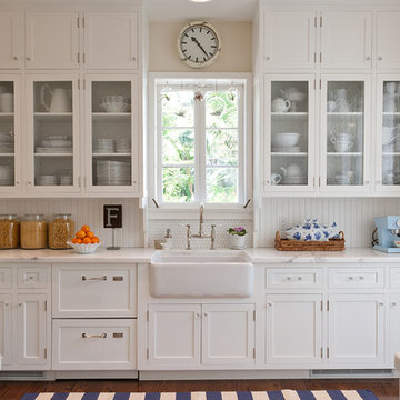
Custom maple kitchen in a 1920 Mediterranean Revival designed to coordinate with original butler's pantry. White painted shaker cabinets with statuary marble counters. Glass and polished nickel knobs. Dish washer drawers with panels. Wood bead board backspalsh, paired with white glass mosaic tiles behind sink. Waterworks bridge faucet and Rohl Shaw's Original apron front sink. Tyler Florence dinnerware. Glass canisters from West Elm. Wood and zinc monogram and porcelain blue floral fish from Anthropologie. Basket fromDean & Deluca, Napa. Navy stripe Madeleine Weinrib rug. Illy Espresso machine by Francis Francis.
Claudia Uribe
Renovated kitchen with distressed timber beams and plaster walls & ceiling. Huge, custom vent hood made of hand carved limestone blocks and distressed metal cowl with straps & rivets. Countertop mounted pot filler at 60 inch wide pro range with mosaic tile backsplash.
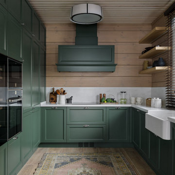
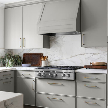
Welcome to our latest kitchen renovation project, where classic French elegance meets contemporary design in the heart of Great Falls, VA. In this transformation, we aim to create a stunning kitchen space that exudes sophistication and charm, capturing the essence of timeless French style with a modern twist.
Our design centers around a harmonious blend of light gray and off-white tones, setting a serene and inviting backdrop for this kitchen makeover. These neutral hues will work in harmony to create a calming ambiance and enhance the natural light, making the kitchen feel open and welcoming.
To infuse a sense of nature and add a striking focal point, we have carefully selected green cabinets. The rich green hue, reminiscent of lush gardens, brings a touch of the outdoors into the space, creating a unique and refreshing visual appeal. The cabinets will be thoughtfully placed to optimize both functionality and aesthetics.
Throughout the project, our focus is on creating a seamless integration of design elements to produce a cohesive and visually stunning kitchen. The cabinetry, hood, light fixture, and other details will be meticulously crafted using high-quality materials, ensuring longevity and a timeless appeal.
Countertop Material: Quartzite
Cabinet: Frameless Custom cabinet
Stove: Ilve 48"
Hood: Plaster field made
Lighting: Hudson Valley Lighting
The client requested a kitchen that would not only provide a great space to cook and enjoy family meals but one that would fit in with her unique design sense. An avid collector of contemporary art, she wanted something unexpected in her 100-year-old home in both color and finishes but still providing a great layout with improved lighting, storage, and superior cooking abilities. The existing kitchen was in a closed off space trapped between the family room and the living. If you were in the kitchen, you were isolated from the rest of the house. Making the kitchen an integrated part of the home was a paramount request.
Step one, remove the wall separating the kitchen from the other rooms in the home which allowed the new kitchen to become an integrated space instead of an isolation room for the cook. Next, we relocated the pantry access which was in the family room to the kitchen integrating a poorly used recess which had become a catch all area which did not provide any usable space for storage or working area. To add valuable function in the kitchen we began by capturing unused "cubbies", adding a walk-in pantry from the kitchen, increasing the storage lost to un-needed drop ceilings and bring light and design to the space with a new large awning window, improved lighting, and combining interesting finishes and colors to reflect the artistic attitude of the client.
A bathroom located above the kitchen had been leaking into the plaster ceiling for several years. That along with knob and tube wiring, rotted beams and a brick wall from the back of the fireplace in the adjacent living room all needed to be brought to code. The walls, ceiling and floors in this 100+ year old home were completely out of level and the room’s foot print could not be increased.
The choice of a Sub-Zero wolf product is a standard in my kitchen designs. The quality of the product, its manufacturing and commitment to food preservation is the reason I specify Sub Zero Wolf. For the cook top, the integrated line of the contemporary cooktop and the signature red knobs against the navy blue of the cabinets added to the design vibe of the kitchen. The cooking performance and the large continuous grate on the cooktop makes it an obvious choice for a cook looking for a great cook top with professional results in a more streamlined profile. We selected a Sharp microwave drawer for the island, an XO wine refrigerator, Bosch dishwasher and Kitchen Aid double convection wall ovens to round out the appliance package.
A recess created by the fireplace was outfitted with a cabinet which now holds small appliances within easy reach of my very petite client. Natural maple accents were used inside all the wall cabinets and repeated on the front of the hood and for the sliding door appliance cabinet and the floating shelves. This allows a brighter interior for the painted cabinets instead of the traditional same interior as exterior finish choice. The was an amazing transformation from the old to the new.
The final touches are the honey bronze hardware from Top Knobs, Mitzi pendants from Hudson Valley Lighting group,
a fabulous faucet from Brizo. To eliminate the old freestanding bottled water cooler, we specified a matching water filter faucet.
GENEVA CABINET COMPANY, LLC., Lake Geneva, WI., -What better way to reflect your lake location than with a splash of blue. This kitchen pairs the bold Naval finish from Shiloh Cabinetry with a bright rim of Polar White Upper cabinets. All is balanced with the warmth of their Maple Gunstock finish on the wine/beverage bar and the subtle texture of Shiplap walls.
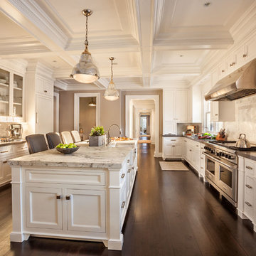
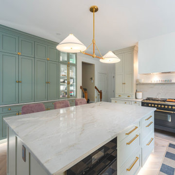
Источник вдохновения для домашнего уюта: большая отдельная, параллельная кухня в классическом стиле с с полувстраиваемой мойкой (с передним бортиком), белыми фасадами, мраморной столешницей, белым фартуком, фартуком из каменной плитки, техникой из нержавеющей стали, темным паркетным полом, островом и фасадами с утопленной филенкой
Свежая идея для дизайна: большая отдельная, параллельная кухня в викторианском стиле с врезной мойкой, фасадами с выступающей филенкой, белыми фасадами, мраморной столешницей, белым фартуком, фартуком из керамической плитки, техникой из нержавеющей стали, островом и темным паркетным полом - отличное фото интерьера
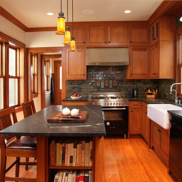
Existing 100 year old Arts and Crafts home. Kitchen space was completely gutted down to framing. In floor heat, chefs stove, custom site-built cabinetry and soapstone countertops bring kitchen up to date.
Designed by Jean Rehkamp and Ryan Lawinger of Rehkamp Larson Architects.
Greg Page Photography
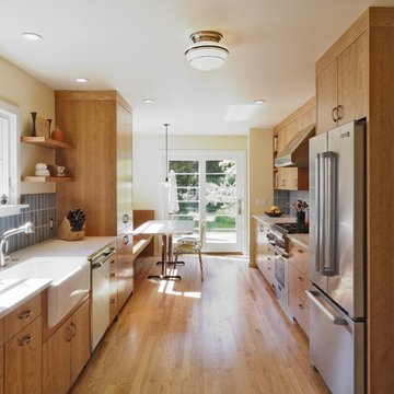
Designed for a 1930s Portland, OR home, this kitchen remodel aims for a clean, timeless sensibility without sacrificing the space to generic modernism. Cherry cabinets, Ice Stone countertops and Heath tile add texture and variation in an otherwise sleek, pared down design. A custom built-in bench works well for eat-in breakfasts. Period reproduction lighting, Deco pulls, and a custom formica table root the kitchen to the origins of the home.
All photos by Matt Niebuhr. www.mattniebuhr.com
Welcome to our latest kitchen renovation project, where classic French elegance meets contemporary design in the heart of Great Falls, VA. In this transformation, we aim to create a stunning kitchen space that exudes sophistication and charm, capturing the essence of timeless French style with a modern twist.
Our design centers around a harmonious blend of light gray and off-white tones, setting a serene and inviting backdrop for this kitchen makeover. These neutral hues will work in harmony to create a calming ambiance and enhance the natural light, making the kitchen feel open and welcoming.
To infuse a sense of nature and add a striking focal point, we have carefully selected green cabinets. The rich green hue, reminiscent of lush gardens, brings a touch of the outdoors into the space, creating a unique and refreshing visual appeal. The cabinets will be thoughtfully placed to optimize both functionality and aesthetics.
Throughout the project, our focus is on creating a seamless integration of design elements to produce a cohesive and visually stunning kitchen. The cabinetry, hood, light fixture, and other details will be meticulously crafted using high-quality materials, ensuring longevity and a timeless appeal.
Countertop Material: Quartzite
Cabinet: Frameless Custom cabinet
Stove: Ilve 48"
Hood: Plaster field made
Lighting: Hudson Valley Lighting
Источник вдохновения для домашнего уюта: отдельная, п-образная кухня среднего размера в стиле неоклассика (современная классика) с с полувстраиваемой мойкой (с передним бортиком), фасадами с выступающей филенкой, серыми фасадами, мраморной столешницей, белым фартуком, фартуком из мрамора, техникой из нержавеющей стали, паркетным полом среднего тона, полуостровом, коричневым полом и белой столешницей
These vintage window sashes replaced the early 60's garden window that would never have been in a 1920's house! Farmhouse sink and Bridge faucet from Vintage Tub & Bath.
Источник вдохновения для домашнего уюта: отдельная, параллельная кухня среднего размера в викторианском стиле с двойной мойкой, фасадами с утопленной филенкой, зелеными фасадами, столешницей из кварцевого агломерата, зеленым фартуком, фартуком из керамической плитки, белой техникой, паркетным полом среднего тона, островом, коричневым полом и белой столешницей
Download our free ebook, Creating the Ideal Kitchen. DOWNLOAD NOW
The homeowners came to us looking to update the kitchen in their historic 1897 home. The home had gone through an extensive renovation several years earlier that added a master bedroom suite and updates to the front façade. The kitchen however was not part of that update and a prior 1990’s update had left much to be desired. The client is an avid cook, and it was just not very functional for the family.
The original kitchen was very choppy and included a large eat in area that took up more than its fair share of the space. On the wish list was a place where the family could comfortably congregate, that was easy and to cook in, that feels lived in and in check with the rest of the home’s décor. They also wanted a space that was not cluttered and dark – a happy, light and airy room. A small powder room off the space also needed some attention so we set out to include that in the remodel as well.
See that arch in the neighboring dining room? The homeowner really wanted to make the opening to the dining room an arch to match, so we incorporated that into the design.
Another unfortunate eyesore was the state of the ceiling and soffits. Turns out it was just a series of shortcuts from the prior renovation, and we were surprised and delighted that we were easily able to flatten out almost the entire ceiling with a couple of little reworks.
Other changes we made were to add new windows that were appropriate to the new design, which included moving the sink window over slightly to give the work zone more breathing room. We also adjusted the height of the windows in what was previously the eat-in area that were too low for a countertop to work. We tried to keep an old island in the plan since it was a well-loved vintage find, but the tradeoff for the function of the new island was not worth it in the end. We hope the old found a new home, perhaps as a potting table.
Designed by: Susan Klimala, CKD, CBD
Photography by: Michael Kaskel
For more information on kitchen and bath design ideas go to: www.kitchenstudio-ge.com
Отдельная кухня – фото дизайна интерьера
1