Стиль Неоклассика (Современная классика) – квартиры и дома со средним бюджетом
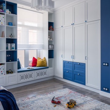
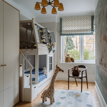
?На этапе проектирования мы сразу сделали все рабочие чертежи для для комфортной расстановки мебели для нескольких детей, так что комната будет расти вместе с количеством жителей.
?Из комнаты есть выход на большой остекленный балкон, который вмещает в себя рабочую зону для уроков и спорт уголок, который заказчики доделают в процессе взросления деток.
?На стене у нас изначально планировался другой сюжет, но ручная роспись в виде карты мира получилась даже лучше, чем мы планировали.
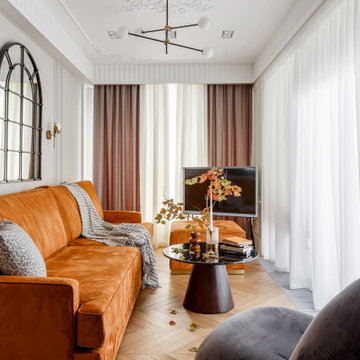
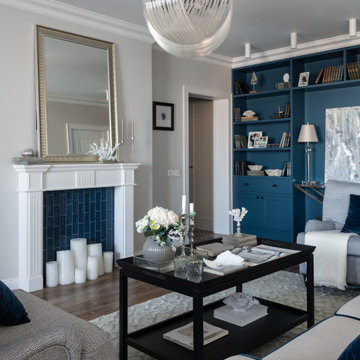
На фото: парадная гостиная комната среднего размера, в белых тонах с отделкой деревом в стиле неоклассика (современная классика) с серыми стенами, паркетным полом среднего тона, стандартным камином, фасадом камина из дерева, отдельно стоящим телевизором, коричневым полом, балками на потолке, панелями на стенах, горчичным диваном и зоной отдыха с
Уютная детская в пастельных тонах со сказочными героями на стенах
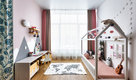
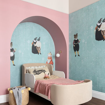
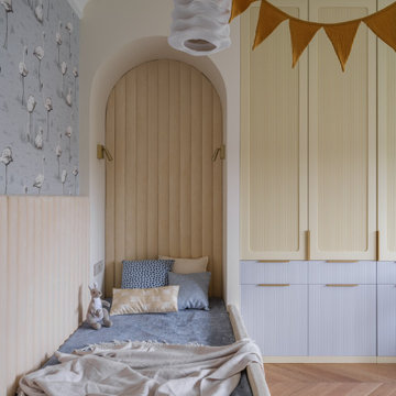
Идея дизайна: детская среднего размера в стиле неоклассика (современная классика) с спальным местом, зелеными стенами, паркетным полом среднего тона и коричневым полом для ребенка от 4 до 10 лет, девочки
Идея дизайна: детская среднего размера в стиле неоклассика (современная классика) с спальным местом, зелеными стенами, паркетным полом среднего тона и коричневым полом для ребенка от 4 до 10 лет, девочки
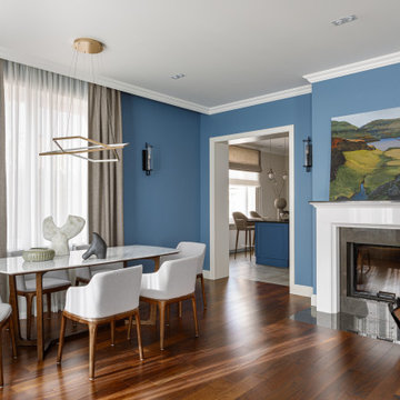
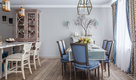
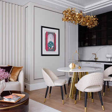
На фото: столовая среднего размера в стиле неоклассика (современная классика) с синими стенами, темным паркетным полом, стандартным камином, фасадом камина из камня и коричневым полом с
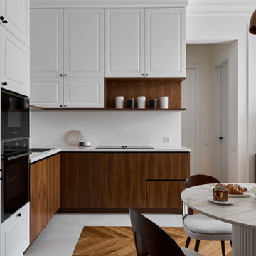
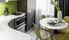
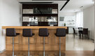
Пример оригинального дизайна: угловая кухня-гостиная среднего размера, в белых тонах с отделкой деревом в стиле неоклассика (современная классика) с врезной мойкой, фасадами с утопленной филенкой, белыми фасадами, столешницей из акрилового камня, белым фартуком, черной техникой, полом из керамогранита, белым полом, белой столешницей и двухцветным гарнитуром без острова
Детские комнаты для двух девочек тоже спроектированы в нежных оттенках, имеют много места для хранения и письменные столы для занятий и кровати, изголовье которых расположено в нише, для создания ощущения защищённости и комфорта. Подвесные светильники авторства ONG CEN KUANG, созданные из текстильных молний для одежды мы так же привезли сами для заказчиков с острова Бали.
Цветовая палитра проекта разнообразна, но в то же время отчасти сдержана. Нам хотелось добавить цветовые акценты, создать радостный, сочный интерьер, так подходящий по темпераменту заказчикам.
Детская комната ,детская,обои.классика,интерьер,домик.сталинка,голубой,белый,шкаф
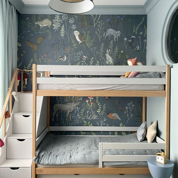
Стильный дизайн: нейтральная детская с игровой среднего размера в стиле неоклассика (современная классика) - последний тренд
Стильный дизайн: нейтральная детская с игровой среднего размера в стиле неоклассика (современная классика) - последний тренд
Основная задача: создать современный светлый интерьер для молодой семейной пары с двумя детьми.
В проекте большая часть материалов российского производства, вся мебель российского производства.
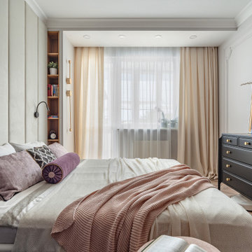
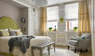
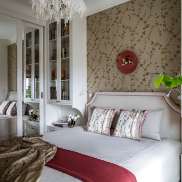
На фото: хозяйская спальня среднего размера в стиле неоклассика (современная классика) с бежевыми стенами, полом из ламината, бежевым полом и зонированием шторами
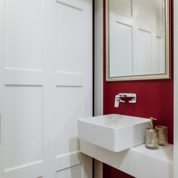
Идея дизайна: маленький туалет в стиле неоклассика (современная классика) с фасадами с выступающей филенкой, белыми фасадами, инсталляцией, красными стенами, паркетным полом среднего тона, накладной раковиной, столешницей из искусственного камня, желтым полом, белой столешницей и подвесной тумбой для на участке и в саду
Павшинская пойма: американская классика, topcer ,синий стеллаж, имитация камина, фальш камин, рыжая входная дверь, оранжевая входная дверь, вид на реку, лофт перегородка, зелёная плитка, синие витрины в кабинете
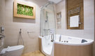
Пример оригинального дизайна: маленькая ванная комната в стиле неоклассика (современная классика) с фасадами в стиле шейкер, синими фасадами, ванной в нише, душем над ванной, белой плиткой, плиткой кабанчик, серыми стенами, полом из керамогранита, врезной раковиной, столешницей из искусственного кварца, шторкой для ванной, белой столешницей, тумбой под одну раковину, встроенной тумбой, разноцветным полом и душевой кабиной для на участке и в саду
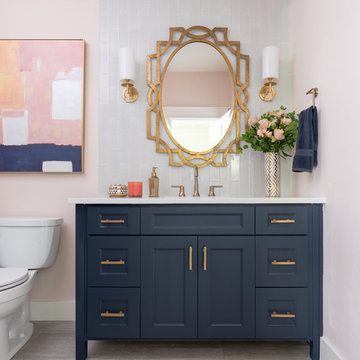
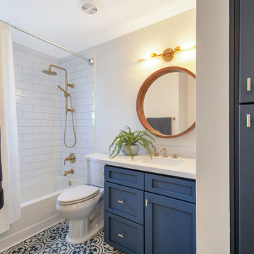
Стильный дизайн: ванная комната среднего размера в стиле неоклассика (современная классика) с синими фасадами, синей плиткой, стеклянной плиткой, розовыми стенами, душевой кабиной, врезной раковиной, столешницей из кварцита, белой столешницей, фасадами с утопленной филенкой, раздельным унитазом и серым полом - последний тренд
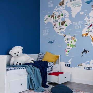
?На этапе проектирования мы сразу сделали все рабочие чертежи для для комфортной расстановки мебели для нескольких детей, так что комната будет расти вместе с количеством жителей.
?Из комнаты есть выход на большой остекленный балкон, который вмещает в себя рабочую зону для уроков и спорт уголок, который заказчики доделают в процессе взросления деток.
?На стене у нас изначально планировался другой сюжет, но ручная роспись в виде карты мира получилась даже лучше, чем мы планировали.
Уютная спальня в стиле Прованс, с мягким текстильным оформлением и терракотовыми акцентами.
Стильный дизайн: хозяйская спальня среднего размера, в светлых тонах в стиле неоклассика (современная классика) с бежевыми стенами и обоями на стенах без камина - последний тренд
Стильный дизайн: хозяйская спальня среднего размера, в светлых тонах в стиле неоклассика (современная классика) с бежевыми стенами и обоями на стенах без камина - последний тренд
Трехкомнатная квартира на Мичуринском проспекте в Москве.
Стиль - современная классика. На полу инженерная доска Coswic; мрамор, оставшийся от прежнего ремонта. На стенах краска. Двери, встроенная мебель московских фабрик.
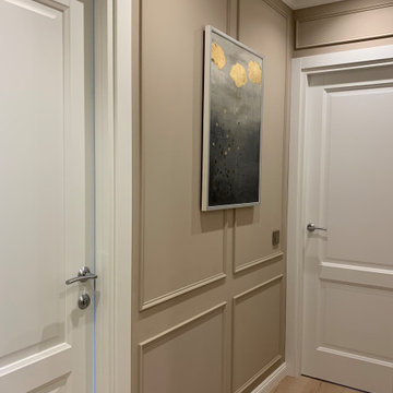
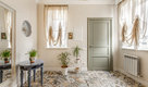
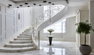
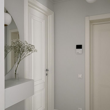
Коридор с отделкой стен декоративным молдингом.
Стильный дизайн: коридор среднего размера в стиле неоклассика (современная классика) с бежевыми стенами, полом из ламината и бежевым полом - последний тренд
Стильный дизайн: коридор среднего размера в стиле неоклассика (современная классика) с бежевыми стенами, полом из ламината и бежевым полом - последний тренд
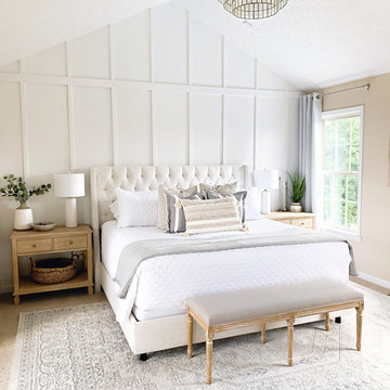
Пример оригинального дизайна: хозяйская спальня среднего размера в стиле неоклассика (современная классика) с белыми стенами, ковровым покрытием и бежевым полом без камина
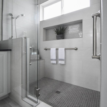
What makes a bathroom accessible depends on the needs of the person using it, which is why we offer many custom options. In this case, a difficult to enter drop-in tub and a tiny separate shower stall were replaced with a walk-in shower complete with multiple grab bars, shower seat, and an adjustable hand shower. For every challenge, we found an elegant solution, like placing the shower controls within easy reach of the seat. Along with modern updates to the rest of the bathroom, we created an inviting space that's easy and enjoyable for everyone.
Стиль Неоклассика (Современная классика) – квартиры и дома со средним бюджетом
1