Туалет с фасадами в стиле шейкер и черной столешницей – фото дизайна интерьера
Сортировать:
Бюджет
Сортировать:Популярное за сегодня
1 - 20 из 136 фото
1 из 3
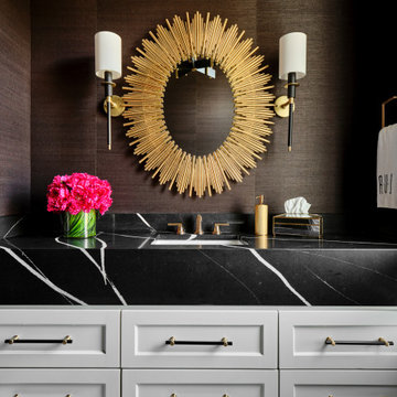
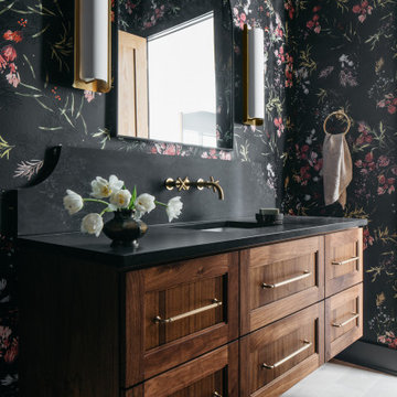
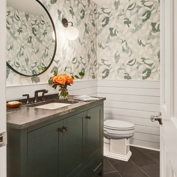
The dramatic powder bath provides a sophisticated spot for guests. Geometric black and white floor tile and a dramatic apron countertop provide contrast against the white floating vanity. Black and gold accents tie the space together and a fuchsia bouquet of flowers adds a punch of color.
Идея дизайна: туалет среднего размера в современном стиле с фасадами в стиле шейкер, бежевыми фасадами, врезной раковиной и черной столешницей
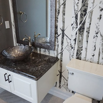
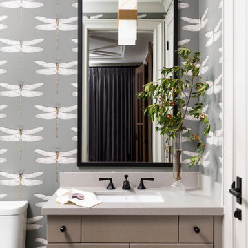
Свежая идея для дизайна: маленький туалет в стиле неоклассика (современная классика) с фасадами в стиле шейкер, черными фасадами, паркетным полом среднего тона, врезной раковиной, столешницей из искусственного кварца, коричневым полом, черной столешницей, встроенной тумбой и обоями на стенах для на участке и в саду - отличное фото интерьера
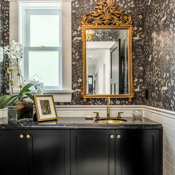
Deep, rich green adds drama as well as the black honed granite surface. Arch mirror repeats design element throughout the home. Savoy House black sconces and matte black hardware.
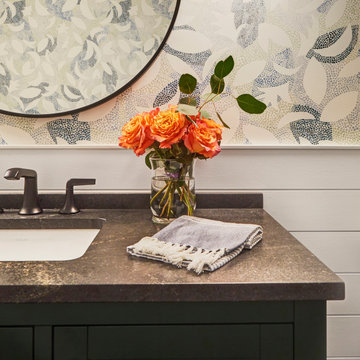
На фото: туалет среднего размера в современном стиле с фасадами в стиле шейкер, белыми фасадами, раздельным унитазом, серыми стенами, полом из керамогранита, настольной раковиной, столешницей из искусственного кварца, серым полом и черной столешницей
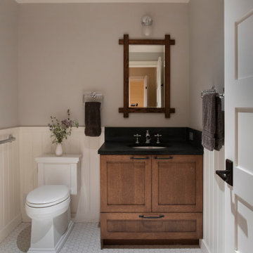
На фото: маленький туалет в стиле кантри с фасадами в стиле шейкер, коричневыми фасадами, раздельным унитазом, серыми стенами, полом из керамогранита, врезной раковиной, столешницей из искусственного кварца, белым полом, черной столешницей и встроенной тумбой для на участке и в саду с
Lido House, Autograph Collection
Photographer: Ryan Garvin
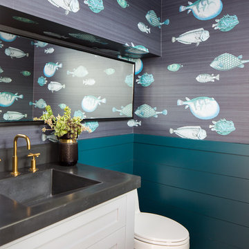
На фото: туалет в морском стиле с фасадами в стиле шейкер, белыми фасадами, унитазом-моноблоком, синими стенами, светлым паркетным полом, монолитной раковиной и черной столешницей
На фото: туалет в морском стиле с фасадами в стиле шейкер, белыми фасадами, унитазом-моноблоком, синими стенами, светлым паркетным полом, монолитной раковиной и черной столешницей
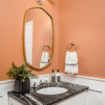
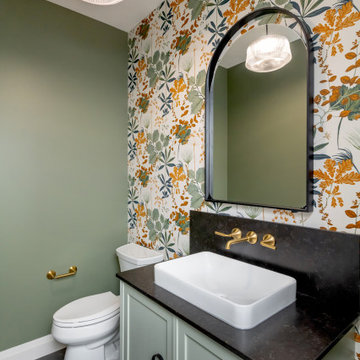
Идея дизайна: маленький туалет в стиле неоклассика (современная классика) с фасадами в стиле шейкер, белыми фасадами, оранжевыми стенами, врезной раковиной, мраморной столешницей, черной столешницей, встроенной тумбой и панелями на стенах для на участке и в саду
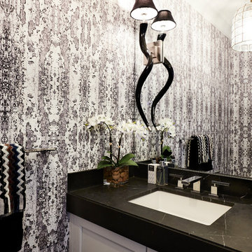
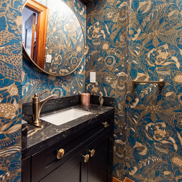
Simple touches in this guest bathroom. Wallpaper is Harlequin, Light is John Richards, Mirror is custom, and the vase is Thompson Hanson
Источник вдохновения для домашнего уюта: туалет среднего размера в стиле модернизм с фасадами в стиле шейкер, коричневыми фасадами, разноцветными стенами, полом из ламината, черной столешницей, встроенной тумбой и обоями на стенах
Источник вдохновения для домашнего уюта: туалет среднего размера в стиле модернизм с фасадами в стиле шейкер, коричневыми фасадами, разноцветными стенами, полом из ламината, черной столешницей, встроенной тумбой и обоями на стенах
Download our free ebook, Creating the Ideal Kitchen. DOWNLOAD NOW
Lakefront property in the northwest suburbs of Chicago is hard to come by, so when we were hired by this young family with exactly that, we were immediately inspired by not just the unusually large footprint of this 1950’s colonial revival but also the lovely views of the manmade lake it was sited on. The large 5-bedroom home was solidly stuck in the 1980’s, but we saw tons of potential. We started out by updating the existing staircase with a fresh coat of paint and adding new herringbone slate to the entry hall.
The powder room off the entryway also got a refresh - new flooring, new cabinets and fixtures. We ran the new slate right through into this space for some consistency. A fun wallpaper and shiplap trim add a welcoming feel and set the tone for the home.
Next, we tackled the kitchen. Located away from the rest of the first floor, the kitchen felt a little isolated, so we immediately began planning for how to better connect it to the rest of the first floor. We landed on removing the wall between the kitchen and dining room and designed a modified galley style space with separate cooking and clean up zones. The cooking zone consists of the refrigerator, prep sink and cooktop, along with a nice long run of prep space at the island. The cleanup side of the kitchen consists of the main sink and dishwasher. Both areas are situated so that the user can view the lake during prep work and cleanup!
One of the home’s main puzzles was how to incorporate the mudroom and area in front of the patio doors at the back of the house. We already had a breakfast table area, so the space by the patio doors was a bit of a no man’s land. We decided to separate the kitchen proper from what became the new mudroom with a large set of barn doors. That way you can quickly hide any mudroom messes but have easy access to the light coming in through the patio doors as well as the outdoor grilling station. We also love the impact the barn doors add to the overall space.
The homeowners’ first words to us were “it’s time to ditch the brown,” so we did! We chose a lovely blue pallet that reflects the home’s location on the lake which is also vibrant yet easy on the eye. Countertops are white quartz, and the natural oak floor works well with the other honey accents. The breakfast table was given a refresh with new chairs, chandelier and window treatments that frame the gorgeous views of the lake out the back.
We coordinated the slate mudroom flooring with that used in the home’s main entrance for a consistent feel. The storage area consists of open and closed storage to allow for some clutter control as needed.
Next on our “to do” list was revamping the dated brown bar area in the neighboring dining room. We eliminated the clutter by adding some closed cabinets and did some easy updates to help the space feel more current. One snag we ran into here was the discovery of a beam above the existing open shelving that had to be modified with a smaller structural beam to allow for our new design to work. This was an unexpected surprise, but in the end we think it was well worth it!
We kept the colors here a bit more muted to blend with the homeowner’s existing furnishings. Open shelving and polished nickel hardware add some simple detail to the new entertainment zone which also looks out onto the lake!
Next we tackled the upstairs starting with the homeowner’s son’s bath. The bath originally had both a tub shower and a separate shower, so we decided to swap out the shower for a new laundry area. This freed up some space downstairs in what used to be the mudroom/laundry room and is much more convenient for daily laundry needs.
We continued the blue palette here with navy cabinetry and the navy tile in the shower. Porcelain floor tile and chrome fixtures keep maintenance to a minimum while matte black mirrors and lighting add some depth the design. A low maintenance runner adds some warmth underfoot and ties the whole space together.
We added a pocket door to the bathroom to minimize interference with the door swings. The left door of the laundry closet is on a 180 degree hinge to allow for easy full access to the machines. Next we tackled the master bath which is an en suite arrangement. The original was typical of the 1980’s with the vanity outside of the bathroom, situated near the master closet. And the brown theme continued here with multiple shades of brown.
Our first move was to segment off the bath and the closet from the master bedroom. We created a short hall from the bedroom to the bathroom with his and hers walk-in closets on the left and right as well as a separate toilet closet outside of the main bathroom for privacy and flexibility.
The original bathroom had a giant soaking tub with steps (dangerous!) as well as a small shower that did not work well for our homeowner who is 6’3”. With other bathtubs in the home, they decided to eliminate the tub and create an oversized shower which takes up the space where the old tub was located. The double vanity is on the opposite wall and a bench is located under the window for morning conversations and a place to set a couple of towels.
The pallet in here is light and airy with a mix of blond wood, creamy porcelain and marble tile, and brass accents. A simple roman shade adds some texture and it’s top-down mechanism allows for light and privacy.
This large whole house remodel gave our homeowners not only the ability to maximize the potential of their home but also created a lovely new frame from which to view their fabulous lake views.
Designed by: Susan Klimala, CKD, CBD
Photography by: Michael Kaskel
For more information on kitchen and bath design ideas go to: www.kitchenstudio-ge.com
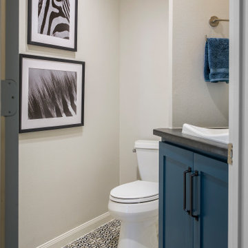
Источник вдохновения для домашнего уюта: туалет среднего размера в стиле неоклассика (современная классика) с фасадами в стиле шейкер, синими фасадами, раздельным унитазом, бежевыми стенами, полом из керамической плитки, накладной раковиной, столешницей из гранита, разноцветным полом и черной столешницей
На фото: туалет среднего размера в стиле кантри с фасадами в стиле шейкер, зелеными фасадами, унитазом-моноблоком, зелеными стенами, полом из винила, настольной раковиной, столешницей из искусственного кварца, черным полом, черной столешницей, напольной тумбой и обоями на стенах с
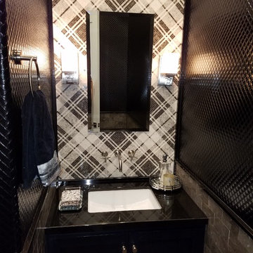
Идея дизайна: туалет среднего размера в стиле неоклассика (современная классика) с фасадами в стиле шейкер, черными фасадами, черно-белой плиткой, серой плиткой, разноцветной плиткой, белой плиткой, плиткой мозаикой, разноцветными стенами, врезной раковиной, столешницей из кварцита и черной столешницей
Пример оригинального дизайна: туалет в стиле неоклассика (современная классика) с фасадами в стиле шейкер, темными деревянными фасадами, разноцветными стенами, светлым паркетным полом, врезной раковиной, серым полом, черной столешницей, подвесной тумбой и обоями на стенах
Custom Kitchen, Laundry, and Powder Room Remodel
На фото: маленький туалет в стиле неоклассика (современная классика) с фасадами в стиле шейкер, белыми фасадами, раздельным унитазом, серыми стенами, полом из керамогранита, накладной раковиной, столешницей из искусственного кварца, серым полом, черной столешницей и подвесной тумбой для на участке и в саду с
На фото: маленький туалет в стиле неоклассика (современная классика) с фасадами в стиле шейкер, белыми фасадами, раздельным унитазом, серыми стенами, полом из керамогранита, накладной раковиной, столешницей из искусственного кварца, серым полом, черной столешницей и подвесной тумбой для на участке и в саду с
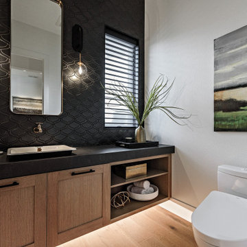
Идея дизайна: туалет в стиле кантри с фасадами в стиле шейкер, светлыми деревянными фасадами, унитазом-моноблоком, черной плиткой, белыми стенами, светлым паркетным полом, настольной раковиной, бежевым полом и черной столешницей
Download our free ebook, Creating the Ideal Kitchen. DOWNLOAD NOW
Lakefront property in the northwest suburbs of Chicago is hard to come by, so when we were hired by this young family with exactly that, we were immediately inspired by not just the unusually large footprint of this 1950’s colonial revival but also the lovely views of the manmade lake it was sited on. The large 5-bedroom home was solidly stuck in the 1980’s, but we saw tons of potential. We started out by updating the existing staircase with a fresh coat of paint and adding new herringbone slate to the entry hall.
The powder room off the entryway also got a refresh - new flooring, new cabinets and fixtures. We ran the new slate right through into this space for some consistency. A fun wallpaper and shiplap trim add a welcoming feel and set the tone for the home.
Next, we tackled the kitchen. Located away from the rest of the first floor, the kitchen felt a little isolated, so we immediately began planning for how to better connect it to the rest of the first floor. We landed on removing the wall between the kitchen and dining room and designed a modified galley style space with separate cooking and clean up zones. The cooking zone consists of the refrigerator, prep sink and cooktop, along with a nice long run of prep space at the island. The cleanup side of the kitchen consists of the main sink and dishwasher. Both areas are situated so that the user can view the lake during prep work and cleanup!
One of the home’s main puzzles was how to incorporate the mudroom and area in front of the patio doors at the back of the house. We already had a breakfast table area, so the space by the patio doors was a bit of a no man’s land. We decided to separate the kitchen proper from what became the new mudroom with a large set of barn doors. That way you can quickly hide any mudroom messes but have easy access to the light coming in through the patio doors as well as the outdoor grilling station. We also love the impact the barn doors add to the overall space.
The homeowners’ first words to us were “it’s time to ditch the brown,” so we did! We chose a lovely blue pallet that reflects the home’s location on the lake which is also vibrant yet easy on the eye. Countertops are white quartz, and the natural oak floor works well with the other honey accents. The breakfast table was given a refresh with new chairs, chandelier and window treatments that frame the gorgeous views of the lake out the back.
We coordinated the slate mudroom flooring with that used in the home’s main entrance for a consistent feel. The storage area consists of open and closed storage to allow for some clutter control as needed.
Next on our “to do” list was revamping the dated brown bar area in the neighboring dining room. We eliminated the clutter by adding some closed cabinets and did some easy updates to help the space feel more current. One snag we ran into here was the discovery of a beam above the existing open shelving that had to be modified with a smaller structural beam to allow for our new design to work. This was an unexpected surprise, but in the end we think it was well worth it!
We kept the colors here a bit more muted to blend with the homeowner’s existing furnishings. Open shelving and polished nickel hardware add some simple detail to the new entertainment zone which also looks out onto the lake!
Next we tackled the upstairs starting with the homeowner’s son’s bath. The bath originally had both a tub shower and a separate shower, so we decided to swap out the shower for a new laundry area. This freed up some space downstairs in what used to be the mudroom/laundry room and is much more convenient for daily laundry needs.
We continued the blue palette here with navy cabinetry and the navy tile in the shower. Porcelain floor tile and chrome fixtures keep maintenance to a minimum while matte black mirrors and lighting add some depth the design. A low maintenance runner adds some warmth underfoot and ties the whole space together.
We added a pocket door to the bathroom to minimize interference with the door swings. The left door of the laundry closet is on a 180 degree hinge to allow for easy full access to the machines. Next we tackled the master bath which is an en suite arrangement. The original was typical of the 1980’s with the vanity outside of the bathroom, situated near the master closet. And the brown theme continued here with multiple shades of brown.
Our first move was to segment off the bath and the closet from the master bedroom. We created a short hall from the bedroom to the bathroom with his and hers walk-in closets on the left and right as well as a separate toilet closet outside of the main bathroom for privacy and flexibility.
The original bathroom had a giant soaking tub with steps (dangerous!) as well as a small shower that did not work well for our homeowner who is 6’3”. With other bathtubs in the home, they decided to eliminate the tub and create an oversized shower which takes up the space where the old tub was located. The double vanity is on the opposite wall and a bench is located under the window for morning conversations and a place to set a couple of towels.
The pallet in here is light and airy with a mix of blond wood, creamy porcelain and marble tile, and brass accents. A simple roman shade adds some texture and it’s top-down mechanism allows for light and privacy.
This large whole house remodel gave our homeowners not only the ability to maximize the potential of their home but also created a lovely new frame from which to view their fabulous lake views.
Designed by: Susan Klimala, CKD, CBD
Photography by: Michael Kaskel
For more information on kitchen and bath design ideas go to: www.kitchenstudio-ge.com
Colin Perry
Источник вдохновения для домашнего уюта: маленький туалет в классическом стиле с фасадами в стиле шейкер, черными фасадами, белой плиткой, черными стенами, полом из мозаичной плитки, врезной раковиной, столешницей из искусственного кварца, серым полом и черной столешницей для на участке и в саду
Источник вдохновения для домашнего уюта: маленький туалет в классическом стиле с фасадами в стиле шейкер, черными фасадами, белой плиткой, черными стенами, полом из мозаичной плитки, врезной раковиной, столешницей из искусственного кварца, серым полом и черной столешницей для на участке и в саду
На фото: маленький туалет в стиле неоклассика (современная классика) с фасадами в стиле шейкер, коричневыми стенами, настольной раковиной, черной столешницей, искусственно-состаренными фасадами, полом из сланца, столешницей из искусственного кварца и серым полом для на участке и в саду с
This Arts and Crafts century home in the heart of Toronto needed brightening and a few structural changes. The client wanted a powder room on the main floor where none existed, a larger coat closet, to increase the opening from her kitchen into her dining room and to completely renovate her kitchen. Along with several other updates, this house came together in such an amazing way. The home is bright and happy, the kitchen is functional with a build-in dinette, and a long island. The renovated dining area is home to stunning built-in cabinetry to showcase the client's pretty collectibles, the light fixtures are works of art and the powder room in a jewel in the center of the home. The unique finishes, including the powder room wallpaper, the antique crystal door knobs, a picket backsplash and unique colours come together with respect to the home's original architecture and style, and an updated look that works for today's modern homeowner. Custom chairs, velvet barstools and freshly painted spaces bring additional moments of well thought out design elements. Mostly, we love that the kitchen, although it appears white, is really a very light gray green called Titanium, looking soft and warm in this new and updated space.
Туалет с фасадами в стиле шейкер и черной столешницей – фото дизайна интерьера
1