Розовая, синяя прихожая – фото дизайна интерьера
Сортировать:
Бюджет
Сортировать:Популярное за сегодня
61 - 80 из 15 001 фото
1 из 3
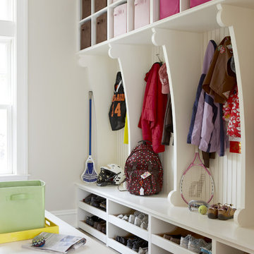
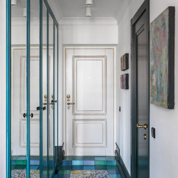
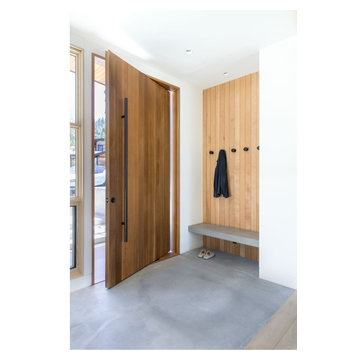
На фото: большой тамбур со шкафом для обуви в классическом стиле с белыми стенами и серым полом с
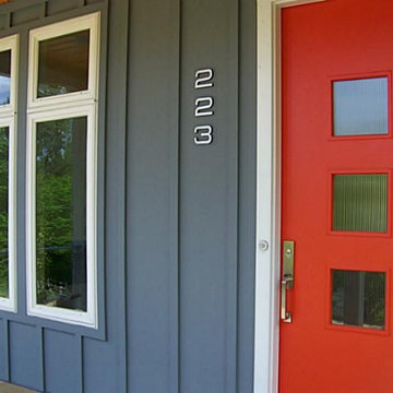
Paragon Mid-Century Modern Adhesive House Numbers paired alongside a Paragon Mid-Century Modern Doorbell. Such a chic exterior! [Paragon is no longer available]
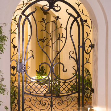
Entry gate with many forged details, including calla lilies and leaves, scrollwork and basket weave.
2013 Top Job Award winner from the National Ornamental and Miscellaneous Metals Association (NOMMA)
http://www.flickr.com/photos/nomma/8589981872/in/set-72157633084857665/
See more at http://facebook.com/GrizzlyIron
Источник вдохновения для домашнего уюта: входная дверь в стиле фьюжн с белыми стенами, одностворчатой входной дверью, белой входной дверью, разноцветным полом и полом из керамической плитки
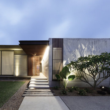
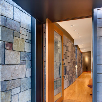
Идея дизайна: входная дверь среднего размера в стиле модернизм с поворотной входной дверью и стеклянной входной дверью
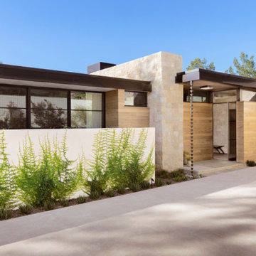
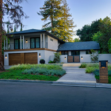
Klopf Architecture, Arterra Landscape Architects and Henry Calvert of Calvert Ventures Designed and built a new warm, modern, Eichler-inspired, open, indoor-outdoor home on a deeper-than-usual San Mateo Highlands property where an original Eichler house had burned to the ground.
The owners wanted multi-generational living and larger spaces than the original home offered, but all parties agreed that the house should respect the neighborhood and blend in stylistically with the other Eichlers. At first the Klopf team considered re-using what little was left of the original home and expanding on it. But after discussions with the owner and builder, all parties agreed that the last few remaining elements of the house were not practical to re-use, so Klopf Architecture designed a new home that pushes the Eichler approach in new directions.
One disadvantage of Eichler production homes is that the house designs were not optimized for each specific lot. A new custom home offered the team a chance to start over. In this case, a longer house that opens up sideways to the south fit the lot better than the original square-ish house that used to open to the rear (west). Accordingly, the Klopf team designed an L-shaped “bar” house with a large glass wall with large sliding glass doors that faces sideways instead of to the rear like a typical Eichler. This glass wall opens to a pool and landscaped yard designed by Arterra Landscape Architects.
Driving by the house, one might assume at first glance it is an Eichler because of the horizontality, the overhanging flat roof eaves, the dark gray vertical siding, and orange solid panel front door, but the house is designed for the 21st Century and is not meant to be a “Likeler.” You won't see any posts and beams in this home. Instead, the ceiling decking is a western red cedar that covers over all the beams. Like Eichlers, this cedar runs continuously from inside to out, enhancing the indoor / outdoor feeling of the house, but unlike Eichlers it conceals a cavity for lighting, wiring, and insulation. Ceilings are higher, rooms are larger and more open, the master bathroom is light-filled and more generous, with a separate tub and shower and a separate toilet compartment, and there is plenty of storage. The garage even easily fits two of today's vehicles with room to spare.
A massive 49-foot by 12-foot wall of glass and the continuity of materials from inside to outside enhance the inside-outside living concept, so the owners and their guests can flow freely from house to pool deck to BBQ to pool and back.
During construction in the rough framing stage, Klopf thought the front of the house appeared too tall even though the house had looked right in the design renderings (probably because the house is uphill from the street). So Klopf Architecture paid the framer to change the roofline from how we had designed it to be lower along the front, allowing the home to blend in better with the neighborhood. One project goal was for people driving up the street to pass the home without immediately noticing there is an "imposter" on this lot, and making that change was essential to achieve that goal.
This 2,606 square foot, 3 bedroom, 3 bathroom Eichler-inspired new house is located in San Mateo in the heart of the Silicon Valley.
Klopf Architecture Project Team: John Klopf, AIA, Klara Kevane
Landscape Architect: Arterra Landscape Architects
Contractor: Henry Calvert of Calvert Ventures
Photography ©2016 Mariko Reed
Location: San Mateo, CA
Year completed: 2016
Highland Park, IL 60035 Colonial Home with Hardie Custom Color Siding Shingle Straight Edge Shake (Front) Lap (Sides), HardieTrim Arctic White ROOF IKO Oakridge Architectural Shingles Estate Gray and installed metal roof front entry portico.
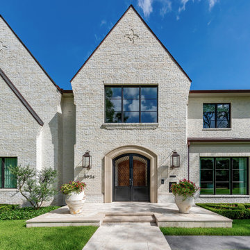
На фото: большая входная дверь в стиле неоклассика (современная классика) с двустворчатой входной дверью и входной дверью из дерева среднего тона с
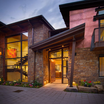
Exterior - Front Entry
Beach House at Avoca Beach by Architecture Saville Isaacs
Project Summary
Architecture Saville Isaacs
https://www.architecturesavilleisaacs.com.au/
The core idea of people living and engaging with place is an underlying principle of our practice, given expression in the manner in which this home engages with the exterior, not in a general expansive nod to view, but in a varied and intimate manner.
The interpretation of experiencing life at the beach in all its forms has been manifested in tangible spaces and places through the design of pavilions, courtyards and outdoor rooms.
Architecture Saville Isaacs
https://www.architecturesavilleisaacs.com.au/
A progression of pavilions and courtyards are strung off a circulation spine/breezeway, from street to beach: entry/car court; grassed west courtyard (existing tree); games pavilion; sand+fire courtyard (=sheltered heart); living pavilion; operable verandah; beach.
The interiors reinforce architectural design principles and place-making, allowing every space to be utilised to its optimum. There is no differentiation between architecture and interiors: Interior becomes exterior, joinery becomes space modulator, materials become textural art brought to life by the sun.
Project Description
Architecture Saville Isaacs
https://www.architecturesavilleisaacs.com.au/
The core idea of people living and engaging with place is an underlying principle of our practice, given expression in the manner in which this home engages with the exterior, not in a general expansive nod to view, but in a varied and intimate manner.
The house is designed to maximise the spectacular Avoca beachfront location with a variety of indoor and outdoor rooms in which to experience different aspects of beachside living.
Client brief: home to accommodate a small family yet expandable to accommodate multiple guest configurations, varying levels of privacy, scale and interaction.
A home which responds to its environment both functionally and aesthetically, with a preference for raw, natural and robust materials. Maximise connection – visual and physical – to beach.
The response was a series of operable spaces relating in succession, maintaining focus/connection, to the beach.
The public spaces have been designed as series of indoor/outdoor pavilions. Courtyards treated as outdoor rooms, creating ambiguity and blurring the distinction between inside and out.
A progression of pavilions and courtyards are strung off circulation spine/breezeway, from street to beach: entry/car court; grassed west courtyard (existing tree); games pavilion; sand+fire courtyard (=sheltered heart); living pavilion; operable verandah; beach.
Verandah is final transition space to beach: enclosable in winter; completely open in summer.
This project seeks to demonstrates that focusing on the interrelationship with the surrounding environment, the volumetric quality and light enhanced sculpted open spaces, as well as the tactile quality of the materials, there is no need to showcase expensive finishes and create aesthetic gymnastics. The design avoids fashion and instead works with the timeless elements of materiality, space, volume and light, seeking to achieve a sense of calm, peace and tranquillity.
Architecture Saville Isaacs
https://www.architecturesavilleisaacs.com.au/
Focus is on the tactile quality of the materials: a consistent palette of concrete, raw recycled grey ironbark, steel and natural stone. Materials selections are raw, robust, low maintenance and recyclable.
Light, natural and artificial, is used to sculpt the space and accentuate textural qualities of materials.
Passive climatic design strategies (orientation, winter solar penetration, screening/shading, thermal mass and cross ventilation) result in stable indoor temperatures, requiring minimal use of heating and cooling.
Architecture Saville Isaacs
https://www.architecturesavilleisaacs.com.au/
Accommodation is naturally ventilated by eastern sea breezes, but sheltered from harsh afternoon winds.
Both bore and rainwater are harvested for reuse.
Low VOC and non-toxic materials and finishes, hydronic floor heating and ventilation ensure a healthy indoor environment.
Project was the outcome of extensive collaboration with client, specialist consultants (including coastal erosion) and the builder.
The interpretation of experiencing life by the sea in all its forms has been manifested in tangible spaces and places through the design of the pavilions, courtyards and outdoor rooms.
The interior design has been an extension of the architectural intent, reinforcing architectural design principles and place-making, allowing every space to be utilised to its optimum capacity.
There is no differentiation between architecture and interiors: Interior becomes exterior, joinery becomes space modulator, materials become textural art brought to life by the sun.
Architecture Saville Isaacs
https://www.architecturesavilleisaacs.com.au/
https://www.architecturesavilleisaacs.com.au/
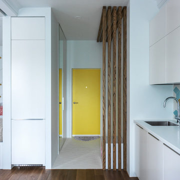
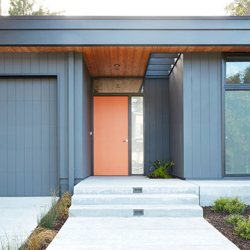
Пример оригинального дизайна: входная дверь в современном стиле с белыми стенами, одностворчатой входной дверью, желтой входной дверью и белым полом
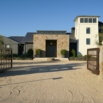
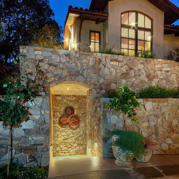
Gated Entry
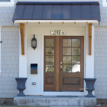
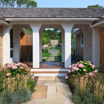
Источник вдохновения для домашнего уюта: огромная входная дверь в стиле кантри с двустворчатой входной дверью и стеклянной входной дверью
Источник вдохновения для домашнего уюта: огромная входная дверь в стиле кантри с двустворчатой входной дверью и стеклянной входной дверью
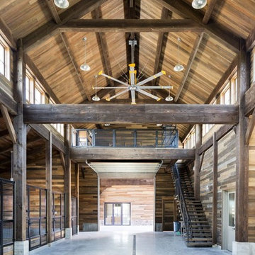
This expansive 10,000 square foot residence has the ultimate in quality, detail, and design. The mountain contemporary residence features copper, stone, and European reclaimed wood on the exterior. Highlights include a 24 foot Weiland glass door, floating steel stairs with a glass railing, double A match grain cabinets, and a comprehensive fully automated control system. An indoor basketball court, gym, swimming pool, and multiple outdoor fire pits make this home perfect for entertaining. Photo: Ric Stovall
Идея дизайна: большое фойе в современном стиле с белыми стенами, паркетным полом среднего тона, двустворчатой входной дверью и черной входной дверью
Photographer: Jay Goodrich
This 2800 sf single-family home was completed in 2009. The clients desired an intimate, yet dynamic family residence that reflected the beauty of the site and the lifestyle of the San Juan Islands. The house was built to be both a place to gather for large dinners with friends and family as well as a cozy home for the couple when they are there alone.
The project is located on a stunning, but cripplingly-restricted site overlooking Griffin Bay on San Juan Island. The most practical area to build was exactly where three beautiful old growth trees had already chosen to live. A prior architect, in a prior design, had proposed chopping them down and building right in the middle of the site. From our perspective, the trees were an important essence of the site and respectfully had to be preserved. As a result we squeezed the programmatic requirements, kept the clients on a square foot restriction and pressed tight against property setbacks.
The delineate concept is a stone wall that sweeps from the parking to the entry, through the house and out the other side, terminating in a hook that nestles the master shower. This is the symbolic and functional shield between the public road and the private living spaces of the home owners. All the primary living spaces and the master suite are on the water side, the remaining rooms are tucked into the hill on the road side of the wall.
Off-setting the solid massing of the stone walls is a pavilion which grabs the views and the light to the south, east and west. Built in a position to be hammered by the winter storms the pavilion, while light and airy in appearance and feeling, is constructed of glass, steel, stout wood timbers and doors with a stone roof and a slate floor. The glass pavilion is anchored by two concrete panel chimneys; the windows are steel framed and the exterior skin is of powder coated steel sheathing.
Brian Vanden Brink
На фото: входная дверь в классическом стиле с одностворчатой входной дверью
На фото: входная дверь в классическом стиле с одностворчатой входной дверью
Розовая, синяя прихожая – фото дизайна интерьера
4