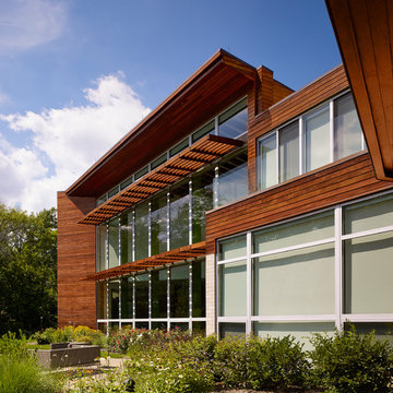
Photo credit: Scott McDonald @ Hedrich Blessing
7RR-Ecohome:
The design objective was to build a house for a couple recently married who both had kids from previous marriages. How to bridge two families together?
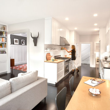
The design looks forward in terms of how people live today. The home is an experiment in transparency and solid form; removing borders and edges from outside to inside the house, and to really depict “flowing and endless space”. The house floor plan is derived by pushing and pulling the house’s form to maximize the backyard and minimize the public front yard while welcoming the sun in key rooms by rotating the house 45-degrees to true north. The angular form of the house is a result of the family’s program, the zoning rules, the lot’s attributes, and the sun’s path. We wanted to construct a house that is smart and efficient in terms of construction and energy, both in terms of the building and the user. We could tell a story of how the house is built in terms of the constructability, structure and enclosure, with a nod to Japanese wood construction in the method in which the siding is installed and the exposed interior beams are placed in the double height space. We engineered the house to be smart which not only looks modern but acts modern; every aspect of user control is simplified to a digital touch button, whether lights, shades, blinds, HVAC, communication, audio, video, or security. We developed a planning module based on a 6-foot square room size and a 6-foot wide connector called an interstitial space for hallways, bathrooms, stairs and mechanical, which keeps the rooms pure and uncluttered. The house is 6,200 SF of livable space, plus garage and basement gallery for a total of 9,200 SF. A large formal foyer celebrates the entry and opens up to the living, dining, kitchen and family rooms all focused on the rear garden. The east side of the second floor is the Master wing and a center bridge connects it to the kid’s wing on the west. Second floor terraces and sunscreens provide views and shade in this suburban setting. The playful mathematical grid of the house in the x, y and z axis also extends into the layout of the trees and hard-scapes, all centered on a suburban one-acre lot.
Many green attributes were designed into the home; Ipe wood sunscreens and window shades block out unwanted solar gain in summer, but allow winter sun in. Patio door and operable windows provide ample opportunity for natural ventilation throughout the open floor plan. Minimal windows on east and west sides to reduce heat loss in winter and unwanted gains in summer. Open floor plan and large window expanse reduces lighting demands and maximizes available daylight. Skylights provide natural light to the basement rooms. Durable, low-maintenance exterior materials include stone, ipe wood siding and decking, and concrete roof pavers. Design is based on a 2' planning grid to minimize construction waste. Basement foundation walls and slab are highly insulated. FSC-certified walnut wood flooring was used. Light colored concrete roof pavers to reduce cooling loads by as much as 15%. 2x6 framing allows for more insulation and energy savings. Super efficient windows have low-E argon gas filled units, and thermally insulated aluminum frames. Permeable brick and stone pavers reduce the site’s storm-water runoff. Countertops use recycled composite materials. Energy-Star rated furnaces and smart thermostats are located throughout the house to minimize duct runs and avoid energy loss. Energy-Star rated boiler that heats up both radiant floors and domestic hot water. Low-flow toilets and plumbing fixtures are used to conserve water usage. No VOC finish options and direct venting fireplaces maintain a high interior air quality. Smart home system controls lighting, HVAC, and shades to better manage energy use. Plumbing runs through interior walls reducing possibilities of heat loss and freezing problems. A large food pantry was placed next to kitchen to reduce trips to the grocery store. Home office reduces need for automobile transit and associated CO2 footprint. Plan allows for aging in place, with guest suite than can become the master suite, with no need to move as family members mature.
Chuck Williams & John Paul Key
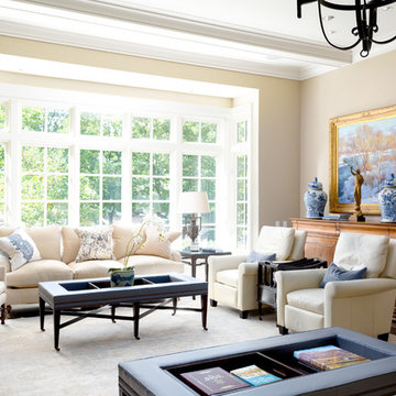
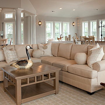
На фото: огромная открытая гостиная комната в стиле неоклассика (современная классика) с серыми стенами, полом из керамогранита, угловым камином, фасадом камина из плитки, телевизором на стене и бежевым полом с
На фото: огромная открытая гостиная комната в стиле неоклассика (современная классика) с серыми стенами, полом из керамогранита, угловым камином, фасадом камина из плитки, телевизором на стене и бежевым полом с
Find the right local pro for your project
Adam Latham, Belair Photography
Стильный дизайн: парадная, изолированная гостиная комната в классическом стиле - последний тренд
Стильный дизайн: парадная, изолированная гостиная комната в классическом стиле - последний тренд
The kitchen, breakfast nook and family room are all connected in an open floor plan. The traditional dining room is easily accessible from the family room.
Photography: Brian Mahany
This house was built in 1994 and our clients have been there since day one. They wanted a complete refresh in their kitchen and living areas and a few other changes here and there; now that the kids were all off to college! They wanted to replace some things, redesign some things and just repaint others. They didn’t like the heavy textured walls, so those were sanded down, re-textured and painted throughout all of the remodeled areas.
The kitchen change was the most dramatic by painting the original cabinets a beautiful bluish-gray color; which is Benjamin Moore Gentleman’s Gray. The ends and cook side of the island are painted SW Reflection but on the front is a gorgeous Merola “Arte’ white accent tile. Two Island Pendant Lights ‘Aideen 8-light Geometric Pendant’ in a bronze gold finish hung above the island. White Carrara Quartz countertops were installed below the Viviano Marmo Dolomite Arabesque Honed Marble Mosaic tile backsplash. Our clients wanted to be able to watch TV from the kitchen as well as from the family room but since the door to the powder bath was on the wall of breakfast area (no to mention opening up into the room), it took up good wall space. Our designers rearranged the powder bath, moving the door into the laundry room and closing off the laundry room with a pocket door, so they can now hang their TV/artwork on the wall facing the kitchen, as well as another one in the family room!
We squared off the arch in the doorway between the kitchen and bar/pantry area, giving them a more updated look. The bar was also painted the same blue as the kitchen but a cool Moondrop Water Jet Cut Glass Mosaic tile was installed on the backsplash, which added a beautiful accent! All kitchen cabinet hardware is ‘Amerock’ in a champagne finish.
In the family room, we redesigned the cabinets to the right of the fireplace to match the other side. The homeowners had invested in two new TV’s that would hang on the wall and display artwork when not in use, so the TV cabinet wasn’t needed. The cabinets were painted a crisp white which made all of their decor really stand out. The fireplace in the family room was originally red brick with a hearth for seating. The brick was removed and the hearth was lowered to the floor and replaced with E-Stone White 12x24” tile and the fireplace surround is tiled with Heirloom Pewter 6x6” tile.
The formal living room used to be closed off on one side of the fireplace, which was a desk area in the kitchen. The homeowners felt that it was an eye sore and it was unnecessary, so we removed that wall, opening up both sides of the fireplace into the formal living room. Pietra Tiles Aria Crystals Beach Sand tiles were installed on the kitchen side of the fireplace and the hearth was leveled with the floor and tiled with E-Stone White 12x24” tile.
The laundry room was redesigned, adding the powder bath door but also creating more storage space. Waypoint flat front maple cabinets in painted linen were installed above the appliances, with Top Knobs “Hopewell” polished chrome pulls. Elements Carrara Quartz countertops were installed above the appliances, creating that added space. 3x6” white ceramic subway tile was used as the backsplash, creating a clean and crisp laundry room! The same tile on the hearths of both fireplaces (E-Stone White 12x24”) was installed on the floor.
The powder bath was painted and 12x36” Ash Fiber Ceramic tile was installed vertically on the wall behind the sink. All hardware was updated with the Signature Hardware “Ultra”Collection and Shades of Light “Sleekly Modern” new vanity lights were installed.
All new wood flooring was installed throughout all of the remodeled rooms making all of the rooms seamlessly flow into each other. The homeowners love their updated home!
Design/Remodel by Hatfield Builders & Remodelers | Photography by Versatile Imaging
Photography - Elouise Van Riet Gray
Источник вдохновения для домашнего уюта: гостиная комната в классическом стиле с белыми стенами
Источник вдохновения для домашнего уюта: гостиная комната в классическом стиле с белыми стенами
We designed the layout of this home around family. The pantry room was transformed into a beautiful, peaceful home office with a cozy corner for the family dog. The living room was redesigned to accommodate the family’s playful pursuits. We designed a stylish outdoor bathroom space to avoid “inside-the-house” messes. The kitchen with a large island and added breakfast table create a cozy space for warm family gatherings.
---Project designed by Courtney Thomas Design in La Cañada. Serving Pasadena, Glendale, Monrovia, San Marino, Sierra Madre, South Pasadena, and Altadena.
For more about Courtney Thomas Design, see here: https://www.courtneythomasdesign.com/
To learn more about this project, see here:
https://www.courtneythomasdesign.com/portfolio/family-friendly-colonial/
Over the past two years, we have had the pleasure of furnishing this gorgeous Craftsman room by room. When our client first came to us in late 2018, she had just purchased this home for a fresh start with her son. This home already had a great foundation, but we wanted to ensure our client's personality shone through with her love of soft colors and layered textures. We transformed this blank canvas into a cozy home by adding wallpaper, refreshing the window treatments, replacing some light fixtures, and bringing in new furnishings.
---
Project designed by interior design studio Kimberlee Marie Interiors. They serve the Seattle metro area including Seattle, Bellevue, Kirkland, Medina, Clyde Hill, and Hunts Point.
For more about Kimberlee Marie Interiors, see here: https://www.kimberleemarie.com/
To learn more about this project, see here
https://www.kimberleemarie.com/lakemont-luxury
The open floor plan of this sunny beach house is dressed in warm neutrals mimicking the colors of driftwood, shells and sand found right outside. Photo by Galie Photography
Raquel Langworthy
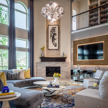
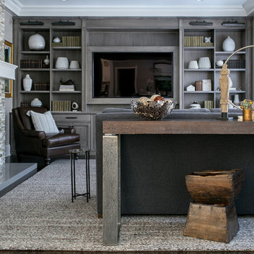
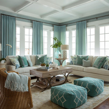
Источник вдохновения для домашнего уюта: открытая гостиная комната среднего размера в стиле неоклассика (современная классика) с с книжными шкафами и полками, серыми стенами, ковровым покрытием, стандартным камином, фасадом камина из камня, мультимедийным центром и коричневым полом
Источник вдохновения для домашнего уюта: открытая гостиная комната среднего размера в стиле неоклассика (современная классика) с с книжными шкафами и полками, серыми стенами, ковровым покрытием, стандартным камином, фасадом камина из камня, мультимедийным центром и коричневым полом
A peek into the family room from the living room. Original white oak flooring was refinished and stained. Walls are painted in BM OC-17 White Dove. Mixed metals are used throughout the room. Family room features a black and white parquet marble cut to size. Walls are Sherwin Williams Foxhall Green #9184. Antique lighting throughout.
In brief
Location, location, location
When looking for your perfect home where you can put down your grass roots and start a family there are many ‘must haves’ that we all have on our wish lists. The obvious contenders are price and location with many other niceties, like the number of bedrooms, layout and decor taking a back seat. As we all know, location can sell a home to those who strive to be in the right area, for transport links, local amenities and the all-important school catchment areas.
Like many other families throughout the UK our clients chose their house for its excellent location. Just ten minutes from the centre of Stafford by car, our client’s house is in a popular and sought-after suburb of the town for couples and families alike. They have always loved the location of their house for its easy access to work, schools, leisure facilities and social connections, but they were becoming increasingly frustrated with the layout of the ground floor of their home.
It’s inevitable that families will evolve and our needs from our properties will change too. Since the young family of four moved to their large four-bedroom detached house a few years ago, their property has been unable to meet their lifestyle needs and living patterns.
Although their property has adequate bedroom space for them and their two children, the layout of the downstairs living area was not functional and it obstructed their everyday life, making entertaining and family gatherings difficult.
Our First Meeting
Upon our initial consultation with our clients it was clear from the outset why they sought to make changes to the layout of their house. The property had been extended to create extra space by the previous owners, but unfortunately the design and build hadn’t been executed well at all. The rooms and layout were awkward in size and shape and it didn’t allow the family to come together and enjoy their home. They had the floor space, but it was sectioned off into separate rooms, some without a purpose.
The garden surrounds the house on all three sides and is of a good size in its entirety with different areas on each aspect. We could clearly see that the house itself didn’t address any particular aspect of the garden in any way.
Moving to a new house wasn’t an option, the family were happy with the location and size of the property. What they wanted was a modern, functional, stylish space for everyday family life, with the flexibility to accommodate their large extended family when needed and to ultimately add value to their property.
We were appointed by our clients to create a design solution to redesign the ground floor living area with a modern, light filled, open plan space that connects with the garden. It was clear from outset that our design intention was to break down the room barriers and to respond to the needs of the family, supporting their lifestyle now and for the future, bringing them together and creating a house they could call a home.
Delivering a project on time and within our client’s budget are always a top priority for our team. The family decided to stay in their house during construction, therefore it was even more essential to minimise the level of disruption to their daily lifestyle with a young family living on site.
The family needed help from our team at Croft Architecture to swiftly and successfully acquire Building Control Approval for their project to progress rapidly, ensuring project completion on time and to their determined budget.
Our Approach
Surveying the site
The client’s home is located on the entrance to a quiet cul-de-sac on a mature, leafy, suburban housing estate. Their home nestles into its well-established site, with ample space between the neighbouring properties and has considerable garden space to the rear and both sides.
During our initial visit we spent a long time with the family observing the existing layout, talking about how they currently live in the property, their annoyances with the house in its current form, how they would like to be able to live in their family home and how they aspired it to feel, look and live.
We walked through the house and it was clear that the existing layout didn’t work downstairs. The house had been extended onto before they had bought the property and the space hadn’t been well thought through in terms of how it would be used effectively.
The rooms directly to the left off the hallway, didn’t really have a proper function. The previously extended space had resulted in the house with too many rooms and subsequently this had led to a series of impractical spaces.
The long and narrow extension was home to a small U-shaped kitchen at the front of the house, which led onto the dining area and then onto a small room at the back of the extension. For the size of the house the kitchen and dining room in a much smaller and narrower area, leaving larger living areas to the rear of property with copious amounts of dead space. The small kitchen was tucked away at the front of the property which made life difficult for our clients to observe their children playing safely in the garden whilst preparing food and carrying out work in the kitchen. On the opposite side of the property there was another old extension which had a step down into it. This living area had a tiled floor and large glazed windows on all sides which made it feel almost like a conservatory.This area was rarely used by the family as it had no real function, plus it was hot in the summer and cold in the winter. It had become an under utilised space.
We walked around the property and it was clear that the house itself didn’t address their private garden space to any particular aspect in any way, meaning that the garden space was under used because of the poor connections.
The family wanted a combined kitchen, dining, lounge space for daily life and also for entertaining their family.
Design Approach
The size of the property presented the opportunity to substantially reconfigure the family home to create a series of dynamic living spaces oriented towards the large, south-facing garden.
Our team suggested removing the little kitchen from the front of the property and re positioning it within the unused glazed space at the back of the house.
The glazed room had internal French doors with a step down into the space separating it from the lounge. We proposed to remove the French doors, level the floor and make it into one room with the existing lounge.
To connect the new open plan kitchen and living space to the rear and side garden sliding and folding doors were the solution, extending the family’s usable living space by creating a seamless indoor-outdoor flow. There was already a patio area there and it made sense for the kitchen to move to the rear of the house to be close to the patio for easy outside dining.
It was therefore logical to retain the existing living space in it's current location next to the new kitchen, maintaining the natural flow of the house for the family after eating and entertaining in the kitchen.
When making decisions regarding the kitchen design, we worked closely with the family. They thoroughly enjoy spending time cooking and entertaining with their large extended family. To assist with their culinary preparations our clients had aspired to have an induction hob within their new kitchen. As they were working through the design with us, they weren’t sure about an induction hob because of different cooking methods required for certain meals that they like to produce. They particularly like making chapatis which require a round pan and a gas hob. We didn’t see this as a problem and suggested having a single gas burner for purely this purpose whilst still installing an induction hob. They decided to go ahead with our idea, choosing a single gas burner and an induction hob, and it looks great!
The existing lounge space had a corner aspect at the rear property that protruded into the garden. Positioned next to the kitchen and dining space it seemed logical to us for the living area to also open out onto the patio, thus connecting the garden to the house on a wider aspect. To enhance the connection between the garden and the living room we thought that a corner door would work extremely well to really open up this space. The clients really liked the design concept to create a feature of the corner with glazed sliding doors that would completely open the house up to the garden. They were excited about the prospect of the allowing huge amounts of natural light into their home and the flexible access it would provide to the garden.
Once the new kitchen, dining and living space had been concluded, we then had to consider what the previous kitchen and dining area was going to be used for within the small, long side extension. We talked with our clients about a few possible uses. We noticed that the family have a piano and few other musical instruments. It made sense for this space to become a quiet part of the house for them to escape to, play music, read and generally relax in a snug area.
To shorten the length of the new music room and make an additional feature in the newly created open plan kitchen, dining and living area, we reclaimed some of the space from the back of the side extension and opened it up to the main open-plan space, thus creating another new snug. We added an additional design feature within the snug by creating a timber window seat. Not only does it provide extra seating, but it’s also created a snug within a snug, a haven for reading, napping and gazing out into the garden.
As part of their brief our clients also wanted a to incorporate a log burner into their newly remodelled home. To connect the new music room and snug to the living space we proposed to position a two-way log burner where the existing gas fire was located. By retaining a fire in the original location it would minimise the disruption and work required to install the wood burner. However, the theory didn’t turn into reality and the new fire resulted in being quite a task to get it to work. When the contractor began to strip back the existing fireplace, they discovered that fitting the pipe within the building was going to be more challenging than they anticipated because of the poorly constructed extension. It was difficult to execute but it was ultimately achieved.
What lies beneath?
It’s not until you uncover the fabric of the building that you fully understand what’s going on underneath. When the contractor exposed the structure of the house, we found out that the property had been poorly constructed, and they uncovered a lot of poor workmanship from the original builders. As the build progressed the inner skin of the extended structure was exposed, we found that it wasn’t actually strong enough and we needed to make it safe in order to proceed. Going forwards we ensured that the structure was safe, and all issues were identified and immediately rectified.
The previous extensions to the house also presented further challenges as the build progressed. We found that the floors between rooms were not level. We wanted to create the appearance of one space rather than lots of chopped up areas. To do so we needed to alter the floor and ceilings to ensure that they were flush right through the new open plan living space. Also, after removing the internal French doors, the down-stand beam where the doors had previously been were subsequently left prominent down from the ceiling. The design required careful planning and attention to detail to achieve the best looking finished results for the client.
For us, in principle our clients’ scheme at the outset was quite a simple project but when the strip out commenced there was actually a more going on underneath that needed attention before the project could start to take shape. A lot of things needed to be considered to make it work structurally and properly for the family.
When the carpet was initially lifted, we found a parquet floor underneath. The family and our team were extremely excited at the prospect of having a traditional parquet floor that could be sanded down and made good. However, when ‘all’ of the carpet was removed only half of the living room had been covered in parquet flooring and the other half was actually a solid concrete floor. Unfortunately, we couldn’t proceed with the flooring and our clients chose another floor finish.
Making connections
Our team at Croft Architecture have created a new, sleek, spacious family ‘hub’ that’s light with clean lines. The open plan space unites the family of four whilst providing the ability to gather the wider family and seamlessly connecting their home with the garden through the new full length sliding doors. Although they now have plenty of space to gather with the family, they also have areas of seclusion to spread out and escape to when needed.
A strong working relationship between our team, the client and Building Control enabled us to gain the necessary permissions promptly. We enjoyed working with the project team and we’re extremely pleased to successfully deliver the completed project. Although it wasn't in accordance with our client’s timescales with the discovery of hidden structural challenges, we spent the time carefully resolving the issues to unsure that our clients home was not only safe, but also looks great and functions perfectly.
A large open concept kitchen and family room offers full views from end to end. The white kitchen (see previous photo), and its breakfast area, open the open concept family room. The entire space is surrounded by windows which flood the rooms with light.
This client grew up in this 1950’s family home and has now become owner in his adult life. Designing and remodeling this childhood home that the client was very bonded and familiar with was a tall order. This modern twist of original mid-century style combined with an eclectic fusion of modern day materials and concepts fills the room with a powerful presence while maintaining its clean lined austerity and elegance. The kitchen was part of a grander complete home re-design and remodel.
A modern version of a mid-century His and Hers grand master bathroom was created to include all the amenities and nothing left behind! This bathroom has so much noticeable and hidden “POW” that commands its peaceful spa feeling with a lot of attitude. Maintaining ultra-clean lines yet delivering ample design interest at every detail, This bathroom is eclectically a one of a kind luxury statement.
The concept in the laundry room was to create a simple, easy to use and clean space with ample storage and a place removed from the central part of the home to house the necessity of the cats and their litter box needs. There was no need for glamour in the laundry room yet we were able to create a simple highly utilitarian space.
If there is one room in the home that requires frequent visitors to thoroughly enjoy with a huge element of surprise, it’s the powder room! This is a room where you know that eventually, every guest will visit. Knowing this, we created a bold statement with layers of intrigue that would leave ample room for fun conversation with your guests upon their prolonged exit. We kept the lights dim here for that intriguing experience of crafted elegance and created ambiance. The walls of peeling metallic rust are the welcoming gesture to a powder room experience of defiance and elegant mystical complexity.
It's a lucky house guest indeed who gets to stay in this newly remodeled home. This on-suite bathroom allows them their own space and privacy. Both Bedroom and Bathroom offer plenty of storage for an extended stay. Rift White Oak cabinets and sleek Silestone counters make a lovely combination in the bathroom while the bedroom showcases textured white cabinets with a dark walnut wrap.
Photo credit: Fred Donham of PhotographerLink
Фото: Family room – поиск в Идеи дизайна
Our Indianapolis studio gave this home an elegant, sophisticated look with sleek, edgy lighting, modern furniture, metal accents, tasteful art, and printed, textured wallpaper and accessories.
Builder: Old Town Design Group
Photographer - Sarah Shields
---
Project completed by Wendy Langston's Everything Home interior design firm, which serves Carmel, Zionsville, Fishers, Westfield, Noblesville, and Indianapolis.
For more about Everything Home, click here: https://everythinghomedesigns.com/
To learn more about this project, click here:
https://everythinghomedesigns.com/portfolio/midwest-luxury-living/
44