Кухня с серым фартуком – фото дизайна интерьера класса люкс
Сортировать:
Бюджет
Сортировать:Популярное за сегодня
1 - 20 из 13 935 фото
1 из 3
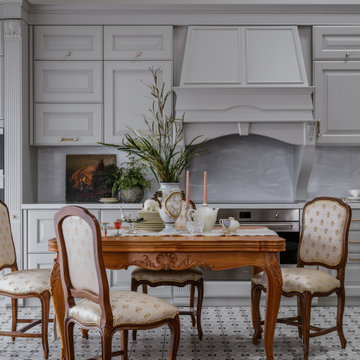
Авторы проекта:
Дизайн: Ярослав и Елена Алдошины (бюро Aldo&Aldo)
Фото: Михаил Чекалов
Стиль: Катя Klee
Отправной точкой в идейном и стилистическом направлении послужила давняя мечта заказчиков жить не просто в новом доме, а создать дом с историей. Интересно, что еще задолго до строительства заказчица получила в подарок прелестные вазоны 18 века, можно сказать с них все и началось. Вместе с заказчиком мы объехали несколько стран в поиске нужных предметов, что-то привезли сами из поездок. Работали с антикваром в Париже. Нами было подобрано искусство близкое по духу.
Владельцы дома - Успешные предприниматели и энергичные люди средних лет, живущие вдвоем, но часто принимающие в гостях своих детей, внуков, родственников и друзей. Предпочитают слушать хорошую музыку на виниле, собираться шумной компанией в кабинете главы семейства, хозяйка дома играет на барабанах, при чем их группа даже сделала камерный концерт «для своих» прямо в гостиной после сдачи объекта. Главное пожелание было создать интерьер с ощущением, что в этом доме прожило уже несколько поколений семейства, создать дом с историей семьи и ее духом.
Основной функциональной задачей было создать закрытую террасу-оранжерею, в которой можно было бы отдохнуть от городской суеты, трансформирующуюся в открытую веранду в теплое время года, спроектировать изразцовую печь, для приготовления блюд и создания особой атмосферы с помощью открытого огня.
Спроектировать кухню, объединённую с гостиной, таким образом, чтобы выделить немалое пространство для отдыха и релаксации у камина, без вмешательства в пространство приготовления блюд.
Так же необходимо было проанализировать оптимальныt маршруты передвижения владельцев по дому, учесть все требования к приватным зонам и спроектировать их максимально комфортно и с учетом ритма жизни хозяев. Исходя из этого родилось планировочное решение, отвечающее требованиям всего семейства.
Планировка создавалась нами с нуля, так как мы вели проектирование с самого начала, еще до возведения конструкций. Поэтому все что было необходимо учесть мы учли на начальных этапах и необходимости в переносе стен и других конструкций не возникло.
Что касается систем хранения. К этому вопросу хозяева дома относятся очень щепетильно и взвешено. Поэтому мы организовали целое помещение площадью 30 м2 в подвальном этаже здания, для хранение сезонных вещей и постирочной, где располагаются как системы хранения, так и техника по уходу за одеждой.
В приватной зоне хозяев на первом этаже мы расположили гардеробную комнату, для хранения вещей владельцев дома.
При входе расположен большой шкаф, для верхней одежды, обуви и других предметов.
Под лестницей мы так же заложили большое пространство для хранения инвентаря для уборки.
Помимо этого, каждая жилая комната имеет внушительный платяной шкаф и другие системы хранения.
Отдельное место в проектировании занимает раздел освещения. Разработаны разные сценарии, как повседневный для уютных посиделок в семейном кругу, так и парадный вариант для встречи гостей. Так например в кухне-гостиной мы разместили две люстры с плафонами в несколько ярусов, т.к высота потолка восемь метров и добавили технический рассеянный свет. В зоне камина расположили две напольные лампы для придания уюта. В зоне кухни продумана подсветка рабочей поверхности. В приватных зонах дома так же использовался технический свет, люстры больше выполняют декоративную функцию, прикроватные лампы для чтения. В зоне террасы располагается верхний свет, люстра над столом, бра и настольные лампы в мягкой зоне.
Цветовая палитра дома выполнена преимущественно в светлых оттенках с добавлением акцентов. В главной парадной части дома палитра возникла из маленького образца ткани для портьер. В других помещениях отправными точками стали винтажные предметы мебели, ковры купленные на антикварных рынках. Стены мы оставили нейтральными чтобы со временем можно было менять настроение с помощью замены текстиля и оббивки мебели. Но одно помещение все же получилось отличным от остальных- это винотека. Там мы создали атмосферу камерную в достаточно насыщенных древесных оттенках, природных зеленых, терракотовых. Терраса получилась садом, и сама продиктовала спокойную серо-древесную гамму.
Предметы мебели тщательно подбирались на протяжении нескольких месяцев поиска. Заказчики очень любят предметы с историей, большинство винтажных привезли из Франции. Хотелось создать смесь Европы и Азии, мы побывали в Китае и привезли несколько аутентичных вещей. Многие вещи коллекционировались годами и были перевезены из прежнего дома. Столярные изделия выполнялись под заказ по нашим эскизам. Кухню заказывали у фабрики Scavollini. Два спальных гарнитура Francesco Pasi в спальне хозяев и гостевой спальне.
К выбору декора мы отнеслись с неменьшим энтузиазмом, получилось целое приключение, в котором участвовали мы и заказчики. Поиски были по разным странам, что-то куплено у нас. Сказать можно одно, что каждую вещь, что вы видите на снимках не была привезена на объект для красоты кадра, а это именно те предметы, которые живут в доме. Например, у заказчицы огромная коллекция фарфора.
Текстиль во многом предопределил интерьер в доме, его мы выбрали практически первым с чего и завязалась цветовая гамма. Ткани преимущественно использовались английские и французские.
Стиль интерьера предопределила архитектура дома, а прежде всего посыл заказчика.
Работали мы в команде с архитектором, т.к считаем важным создавать цельные, гармоничные проекты, где все слажено и дополняет друг друга. Определить стилевое направление достаточно сложно, мы создавали портрет обитателей этого дома с их характером, дом получился очень персонализированным. Но есть одна примечательная черта, в новый дом мы внесли оттенки старины, будто дом живет уже не одно десятилетие.
Как же без сложностей! Кто вам скажет, что можно построить дом мечты легко, слукавит! В процессе стройки возникает множество вопросов, которые требуют четкости, слаженной работы команды, компетентных подрядчиков. В этом проекте сложным узлом было проектирование лестницы и финишных покрытий. Мы перебрали не один вариант и никак не могли найти нужное решение. Но упорство и картинка в голове сделали свое дело, решение было найдено и воплощено в жизнь.
Сроки вместе с проектированием, стройкой дома и отделкой заняли 2,5 года.
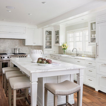
Kitchen Size: 14 Ft. x 15 1/2 Ft.
Island Size: 98" x 44"
Wood Floor: Stang-Lund Forde 5” walnut hard wax oil finish
Tile Backsplash: Here is a link to the exact tile and color: http://encoreceramics.com/product/silver-crackle-glaze/
•2014 MN ASID Awards: First Place Kitchens
•2013 Minnesota NKBA Awards: First Place Medium Kitchens
•Photography by Andrea Rugg
Roehner Ryan
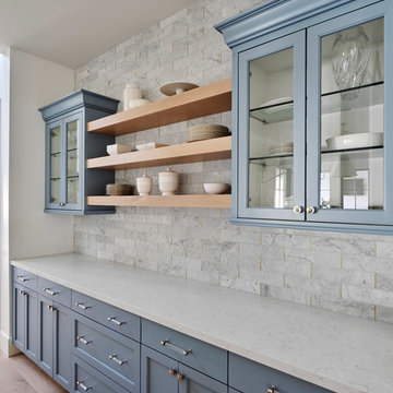
Источник вдохновения для домашнего уюта: большая кухня-гостиная в стиле кантри с с полувстраиваемой мойкой (с передним бортиком), белыми фасадами, столешницей из кварцевого агломерата, серым фартуком, фартуком из мрамора, техникой под мебельный фасад, светлым паркетным полом, островом, бежевым полом, серой столешницей и фасадами в стиле шейкер
Источник вдохновения для домашнего уюта: большая кухня-гостиная в стиле кантри с с полувстраиваемой мойкой (с передним бортиком), белыми фасадами, столешницей из кварцевого агломерата, серым фартуком, фартуком из мрамора, техникой под мебельный фасад, светлым паркетным полом, островом, бежевым полом, серой столешницей и фасадами в стиле шейкер
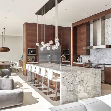
Свежая идея для дизайна: большая угловая кухня в современном стиле с обеденным столом, врезной мойкой, плоскими фасадами, темными деревянными фасадами, мраморной столешницей, серым фартуком, фартуком из каменной плиты, техникой из нержавеющей стали, полом из керамогранита, островом, белым полом и серой столешницей - отличное фото интерьера
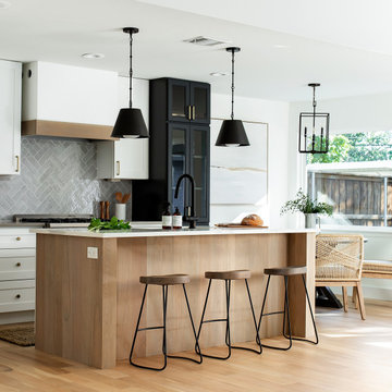
Coastal contemporary finishes and furniture designed by Interior Designer and Realtor Jessica Koltun in Dallas, TX. #designingdreams
Свежая идея для дизайна: угловая кухня среднего размера в морском стиле с обеденным столом, одинарной мойкой, фасадами в стиле шейкер, светлыми деревянными фасадами, столешницей из кварцевого агломерата, серым фартуком, фартуком из керамогранитной плитки, техникой из нержавеющей стали, светлым паркетным полом, островом, коричневым полом и белой столешницей - отличное фото интерьера
Свежая идея для дизайна: угловая кухня среднего размера в морском стиле с обеденным столом, одинарной мойкой, фасадами в стиле шейкер, светлыми деревянными фасадами, столешницей из кварцевого агломерата, серым фартуком, фартуком из керамогранитной плитки, техникой из нержавеющей стали, светлым паркетным полом, островом, коричневым полом и белой столешницей - отличное фото интерьера
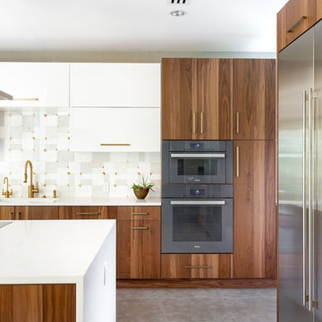
In our world of kitchen design, it’s lovely to see all the varieties of styles come to life. From traditional to modern, and everything in between, we love to design a broad spectrum. Here, we present a two-tone modern kitchen that has used materials in a fresh and eye-catching way. With a mix of finishes, it blends perfectly together to create a space that flows and is the pulsating heart of the home.
With the main cooking island and gorgeous prep wall, the cook has plenty of space to work. The second island is perfect for seating – the three materials interacting seamlessly, we have the main white material covering the cabinets, a short grey table for the kids, and a taller walnut top for adults to sit and stand while sipping some wine! I mean, who wouldn’t want to spend time in this kitchen?!
Cabinetry
With a tuxedo trend look, we used Cabico Elmwood New Haven door style, walnut vertical grain in a natural matte finish. The white cabinets over the sink are the Ventura MDF door in a White Diamond Gloss finish.
Countertops
The white counters on the perimeter and on both islands are from Caesarstone in a Frosty Carrina finish, and the added bar on the second countertop is a custom walnut top (made by the homeowner!) with a shorter seated table made from Caesarstone’s Raw Concrete.
Backsplash
The stone is from Marble Systems from the Mod Glam Collection, Blocks – Glacier honed, in Snow White polished finish, and added Brass.
Fixtures
A Blanco Precis Silgranit Cascade Super Single Bowl Kitchen Sink in White works perfect with the counters. A Waterstone transitional pulldown faucet in New Bronze is complemented by matching water dispenser, soap dispenser, and air switch. The cabinet hardware is from Emtek – their Trinity pulls in brass.
Appliances
The cooktop, oven, steam oven and dishwasher are all from Miele. The dishwashers are paneled with cabinetry material (left/right of the sink) and integrate seamlessly Refrigerator and Freezer columns are from SubZero and we kept the stainless look to break up the walnut some. The microwave is a counter sitting Panasonic with a custom wood trim (made by Cabico) and the vent hood is from Zephyr.
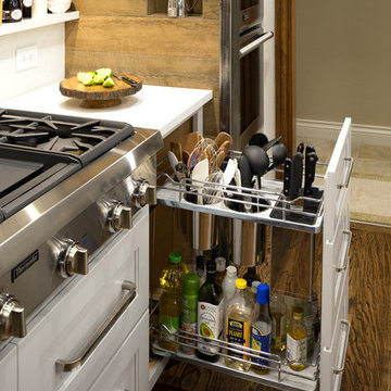
This creative transitional space was transformed from a very dated layout that did not function well for our homeowners - who enjoy cooking for both their family and friends. They found themselves cooking on a 30" by 36" tiny island in an area that had much more potential. A completely new floor plan was in order. An unnecessary hallway was removed to create additional space and a new traffic pattern. New doorways were created for access from the garage and to the laundry. Just a couple of highlights in this all Thermador appliance professional kitchen are the 10 ft island with two dishwashers (also note the heated tile area on the functional side of the island), double floor to ceiling pull-out pantries flanking the refrigerator, stylish soffited area at the range complete with burnished steel, niches and shelving for storage. Contemporary organic pendants add another unique texture to this beautiful, welcoming, one of a kind kitchen! Photos by David Cobb Photography.
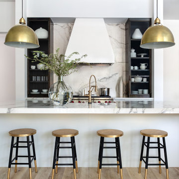
Идея дизайна: огромная п-образная кухня-гостиная в стиле неоклассика (современная классика) с с полувстраиваемой мойкой (с передним бортиком), плоскими фасадами, серыми фасадами, серым фартуком, светлым паркетным полом, островом и белой столешницей
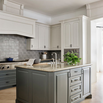
На фото: огромная отдельная кухня в классическом стиле с врезной мойкой, фасадами с выступающей филенкой, серыми фасадами, гранитной столешницей, серым фартуком, фартуком из керамической плитки, техникой из нержавеющей стали, светлым паркетным полом, коричневым полом, бежевой столешницей и островом
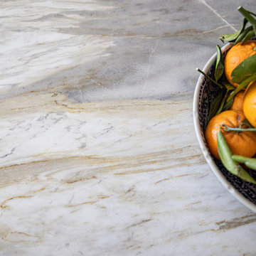
Distinctive quartzite counters are a showstopper, with unique veining and striking color variation, from blue to gray to ochre.
The overall goal was to create an expansive entertaining kitchen that could accommodate our clients’ large gatherings of family and friends, and provide them with several zones for prepping, serving, seating, and socializing. Also high on the clients’ wish list: a more generous island, professional appliances, and better storage. We expanded the island in two directions to allow for comfortable seating at the counter with plenty of room for a table in the breakfast nook. An expandable bar height table in the adjacent dining area offers even more flexibility for eating and socializing.
We designed a custom hutch which has a multitude of storage options and functionality – open display shelves, roll-outs, drawers, extra counter/serving space, as well as a beverage fridge and appliance garage/coffee center. On the opposite side of the kitchen, we replaced a small pantry closet with a furniture style built-in that took advantage of underutilized space. Anticipating issues with supply chain, we opted to use a local cabinet maker on this project which allowed us to fully customize the cabinets for optimal functionality.
Other stand-out features include a Thermador appliance package, workstation farmhouse sink, ‘touch’ faucet, hot+cold water dispenser, and hidden toe-kick storage. Our clients now have a beautiful, cohesive space that reflects their personal style and fulfills their dream of a having an expansive kitchen where they can cook and entertain for years to come.
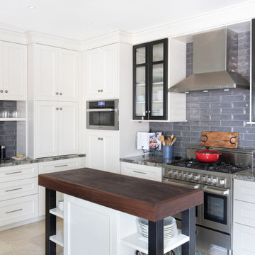
The owners of this kitchen had spent the money to upgrade the finishes in their kitchen upon building the home 12 years ago, but after living in the space for several years they realized how nonfunctional the layout really was. The (then) two preschool aged children had grown into busy, hungry teenagers with many friends who also liked to hang out at the house. So the family needed a more functional kitchen with better traffic flow, space for daily activities revolving around the kitchen at different times of day, and a kitchen that could accommodate cooking for and serving large groups. Furthermore, the dark, traditional finishes no longer reflected the homeowners’ style. They requested a brighter, more relaxed, coastal style that reflected their love of the seaside cities they like to visit.
Originally, the kitchen was U-shaped with a narrow island in the middle. The island created narrow aisles that bottle-necked at the dishwasher, refrigerator, and cooktop areas. There was a pass-through from the foyer into the kitchen, but the owners never liked that the pass-through was also located so close to the powder room. The awkward proximity was unappealing and made guests feel uncomfortable.
The kitchen’s storage was made up of lots of narrow cabinets, apothecary drawers, clipped corner units, and very few drawers. It lacked useful storage for the larger items the family used on a daily basis. And the kitchen’s only pantry was small closet that had only builder-grade, narrow shelving with no illumination to be able to see the contents inside.
Overall, the kitchen’s lighting plan was poorly executed. Only six recessed cans illuminated the entire kitchen and nook areas. The under cabinet lighting was not evenly distributed either. In fact, the builder had mis-placed the under cabinet lighting around the decorative pilasters which made for choppy, dark cubbies. Further, the builder didn’t include any lighting over the sink or the bar area, which meant whoever was doing the dishes was always in their own shadow. That, coupled with the steep overhang of the game room above made the bar area feel like a dim, cavernous space that wasn’t inviting or task oriented. The kitchen looked out into the main living space, but the raised bar and a narrow wall (which held the only large cabinet in the kitchen) created more of a barrier than a relationship to the living room or breakfast nook. In fact, one couldn’t even see the breakfast nook from the cooktop or sink areas due to its orientation. The raised bar top was too narrow to comfortably sit to either dine at or chat from due to the lack of knee space. The the homeowners confided that the kitchen felt more like a dark, dirty prison than place where the family, or their guests, wanted to gather and commune.
The clients' needs and desires were:
➢ to create a kitchen that would be a space the family loved to be in; to relate to the adjacent spaces all around, and to have better flow for entertaining large groups
➢ to remove the walls between the breakfast nook and living area and to be able to utilize the natural light from the windows in both those areas
➢ to incorporate a functional chopping block for prepping fresh food for home cooked meals, an island with a large sink and drain board, 2 pull out trash cans, and seating for at least the 2 teens to eat or do homework
➢ to design a kitchen and breakfast nook with an airy, coastal, relaxed vibe that blended with the rest of the house's coastal theme
➢ to integrate a layered lighting plan which would include ample general illumination, specific task lighting, decorative lighting, and lots of illuminated storage
➢ to design a kitchen with not only more storage for all the husband’s kitchen gadgets and collection of oils and spices, but smart storage, including a coffee/breakfast bar and a place to store and conceal the toaster oven and microwave
➢ to find a way to utilize the large open space between the kitchen, pantry area, and breakfast nook
Twelve Stones Designs achieved the owner's goals by:
➢ removing the walls between the kitchen and living room to allow the natural light to filter in from the adjacent rooms and to create a connection between the kitchen, nook, and living spaces for a sense of unity and communion
➢ removing the existing pantry and designing 3 large pantry style cabinets with LED tape lights and rollout drawers to house lots of kitchen appliances, gadgets, and tons of groceries. We also took the cabinets all the way up to the 9’ ceiling for additional storage for seasonal items and bulk storage.
➢ designing 2 islands - 1 with a gorgeous black walnut chopping block that houses a drawer for chopping and carving knives and a custom double pull out trash unit for point of use utilization - and 1 that houses the dishwasher, a large Blanco Gourmet sink with integrated drain board, woven baskets for fresh root vegetables and kitchen towels, plenty of drawer storage for kitchen items, and bar seating for up to 4 diners.
➢ closing off the space between the kitchen and the powder room to create a beautiful new private alcove for the powder room as well as adding some decorative storage. This also gave us space to include more tall storage near the new range for precision placement of the husband’s extensive oil and spice collection as well as a location for a combo-steam oven the wife wanted for baking and cooking healthy meals.
The project is enhanced functionally by:
➢ incorporated USB and standard receptacles for the kids’ laptops and phone charging in the large island
➢ designing the small island to include additional open shelving for items used on a daily basis such as a variety of bowls, plates, and colanders. This set up also works well for the husband who prefers to “plate” his dinners in restaurant-style fashion before presenting them to the table.
➢ the integration of specific storage units, such as double stacked cutlery drawers, a custom spice pull-out, a Kuerig coffee and tea pod drawer, and custom double stacked utensil drawers
➢ moving the refrigerator to the old oven location - this eliminated the bottle neck as well as created a better relationship to the eating table. It also utilizes the floor space between the pantry, nook, and kitchen
➢ creating a banquet style breakfast nook - this banquette seating not only doubles the amount of seating for large gatherings but it better utilizes the odd space between the kitchen and the previous nook area. It also helps to create a distinct pathway from the mudroom room through the pantry area, kitchen, nook, and living room.
➢ the coffee/breakfast bar area which includes the perfect location for the concealed microwave and toaster oven, convenient storage for the coffee pods and tea accoutrements. Roll-out drawers below also house the smoothie maker, hot water kettle, and a plethora of smoothie-making ingredients such as protein powders, smoothie additives, etc. Furthermore, the drawers below the Keurig house measuring utensil, cutlery, baking supplies and tupperware storage.
➢ incorporating lots of wide drawers and pullouts to accommodate large cookware.
➢ utilizing as much vertical space as possible by building storage to the ceiling which accommodates the family’s abundant amount of serving platters, baking sheets, bakeware, casserole dishes, and additional cutting boards.
The project is enhanced aesthetically by:
➢ new 5-piece Versailles pattern porcelain tile that now seamlessly joins the entire down stairs area together creating a bright, cohesiveness feeling instead of choppy separated spaces - it also adds a coastal feeling
➢ designing a cabinet to conceal the microwave and toaster oven
➢ the coastal influenced light fixtures over the nook table and island
➢ the sandy colors of the Langdon Cambria countertops. The swirling pattern and sparkling quartz pieces remind the homeowner of black-and-tan sandy beaches
➢ the striped banquet seating whose creamy white background and blue-green stripes were the inspiration for the cabinet and wall colors.
➢ All the interior doors were painted black to coordinate with the blacks and grays in the backsplash tile and countertop. This also adds a hint of tailored formality to an otherwise casual space.
➢ the use of WAC's Oculux small aperture LED units for the overhead lighting complimented with Diode LED strips for task lighting under the cabinets and inside the pantry and glass wall cabinets. All of the lighting applications are on separate dimmer switches.
Innovative uses of materials or construction methods by Realty Restoration LLC:
➢ Each 1-1/2” x 3” block of reclaimed end-grain black walnut that makes up the center island chopping block was hand milled and built in the shop. It was designed to look substantial and proportional to the surrounding elements, executed by creating the 4 inch tall top with a solid wood chamfered edge band.
➢ The metal doors on either side of the vent hood were also custom designed for this project and built in the Realty Restoration LLC shop. They are made 1x2, 11-gauge mild steel with ribbed glass. Weighing 60 lbs a piece, heavy duty cabinet hinges were added to support the weight of the door and keep them from sagging.
➢ Under-cabinet receptacles were added along the range wall in order to have a clean, uninterrupted backsplash.
Design obstacles to overcome:
➢ Because we were removing the demising walls between the kitchen and living room, we had to find a way to plumb and vent the new island. We did this by tunneling through the slab (the slab had post tension cables which prevented us from just trenching) to run a new wet vent through a nearby structural wall. We pulled the existing hot and cold lines between upper floor joists and ran them down the structural wall as well and up through a conduit in the tunnel.
➢ Since we were converting from wall overs to a gas range it allowed us to utilize the 220 feed for the wall ovens to provide a new sub panel for all the new kitchen circuits
➢ Due to framing deficiencies inherited from the original build there was a 1-1/2” differential in the floor-to-ceiling height over a 20 foot span; by utilizing the process of cutting and furring coupled with the crown moulding details on the cabinet elevations we were able to mask the problem and provide seamless transitions between the cabinet components.
Evidence of superior craftsmanship:
➢ uniquely designed, one-of-a-kind metal “X” end panels on the large island. The end panels were custom made in the Realty Restoration LLC shop and fitted to the exact dimensions of the island. The welding seams are completely indistinguishable - the posts look like they are cut from a single sheet of metal
➢ square metal posts on the small island were also custom made and designed to compliment and carry through the metal element s throughout the kitchen
➢ the beautiful, oversized end panels on the pantry cabinets which give the breakfast nook a tailored look
➢ integrating a large format 5 piece Versailles tile pattern to seamlessly flow from the existing spaces into the new kitchen space
➢ By constructing a custom cabinet that jogged around a corner we could not remodel (housing the entry way coat closet) we were able to camouflage the adjacent wall offset within the upper and lower cabinets. By designing around the existing jog in the structural walls we accomplished a few things: we were able to find the space to house, and hide, the microwave and toaster oven yet still have a clean cohesive appearance from the kitchen side. Additionally, the owners were able to keep their much needed coat closet and we didn’t have to increase the budget with unnecessary structural work.
agajphoto
Пример оригинального дизайна: угловая, светлая кухня среднего размера в стиле модернизм с обеденным столом, накладной мойкой, белыми фасадами, столешницей из кварцита, серым фартуком, фартуком из керамической плитки, техникой из нержавеющей стали, светлым паркетным полом, островом, бежевым полом и серой столешницей
Пример оригинального дизайна: угловая, светлая кухня среднего размера в стиле модернизм с обеденным столом, накладной мойкой, белыми фасадами, столешницей из кварцита, серым фартуком, фартуком из керамической плитки, техникой из нержавеющей стали, светлым паркетным полом, островом, бежевым полом и серой столешницей
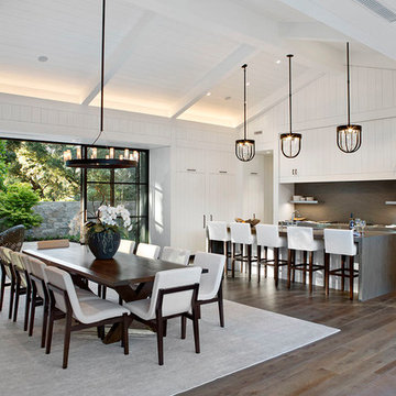
This unassuming Kitchen design offers a simply elegance to the Great Room.
Свежая идея для дизайна: большая кухня в стиле кантри с обеденным столом, белыми фасадами, серым фартуком, островом, столешницей из известняка, фартуком из известняка, техникой под мебельный фасад, паркетным полом среднего тона, коричневым полом и серой столешницей - отличное фото интерьера
Свежая идея для дизайна: большая кухня в стиле кантри с обеденным столом, белыми фасадами, серым фартуком, островом, столешницей из известняка, фартуком из известняка, техникой под мебельный фасад, паркетным полом среднего тона, коричневым полом и серой столешницей - отличное фото интерьера
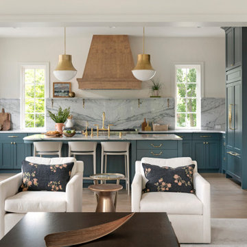
Built in the iconic neighborhood of Mount Curve, just blocks from the lakes, Walker Art Museum, and restaurants, this is city living at its best. Myrtle House is a design-build collaboration with Hage Homes and Regarding Design with expertise in Southern-inspired architecture and gracious interiors. With a charming Tudor exterior and modern interior layout, this house is perfect for all ages.
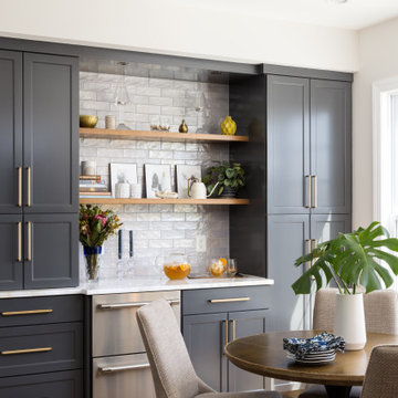
We designed a custom hutch which has a multitude of storage options and functionality – open display shelves, roll-outs, drawers, extra counter/serving space, as well as a beverage fridge and appliance garage/coffee center. On the opposite side of the kitchen, we replaced a small pantry closet with a furniture style built-in that took advantage of underutilized space. Anticipating issues with supply chain, we opted to use a local cabinet maker on this project which allowed us to fully customize the cabinets for optimal functionality.
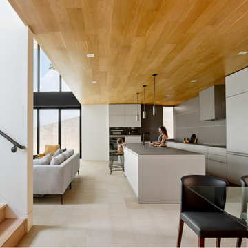
Galley kitchen open to living and dining rooms with gray, flat panel custom cabinets, white walls, beige stone floors, and custom wood ceiling.
На фото: большая параллельная кухня-гостиная в стиле модернизм с врезной мойкой, плоскими фасадами, серыми фасадами, серым фартуком, полом из известняка, островом, бежевым полом и деревянным потолком
На фото: большая параллельная кухня-гостиная в стиле модернизм с врезной мойкой, плоскими фасадами, серыми фасадами, серым фартуком, полом из известняка, островом, бежевым полом и деревянным потолком
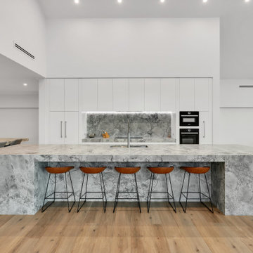
На фото: огромная параллельная, серо-белая кухня-гостиная в стиле модернизм с врезной мойкой, плоскими фасадами, белыми фасадами, черной техникой, островом, бежевым полом, серой столешницей, сводчатым потолком, гранитной столешницей, серым фартуком, фартуком из гранита и полом из винила с
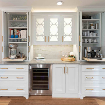
Kitchen beverage station with tower cabinets with pocket doors, glass upper cabinets and furniture-style base moulding at toe-space
На фото: параллельная кухня среднего размера в стиле неоклассика (современная классика) с обеденным столом, с полувстраиваемой мойкой (с передним бортиком), фасадами с утопленной филенкой, белыми фасадами, столешницей из кварцита, серым фартуком, фартуком из кварцевого агломерата, техникой из нержавеющей стали, паркетным полом среднего тона, островом, коричневым полом и серой столешницей с
На фото: параллельная кухня среднего размера в стиле неоклассика (современная классика) с обеденным столом, с полувстраиваемой мойкой (с передним бортиком), фасадами с утопленной филенкой, белыми фасадами, столешницей из кварцита, серым фартуком, фартуком из кварцевого агломерата, техникой из нержавеющей стали, паркетным полом среднего тона, островом, коричневым полом и серой столешницей с
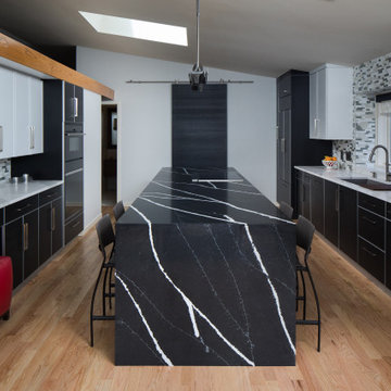
This modern kitchen proves that black and white does not have to be boring, but can truly be BOLD! The wire brushed oak cabinets were painted black and white add texture while the aluminum trim gives it undeniably modern look. Don't let appearances fool you this kitchen was built for cooks, featuring all Sub-Zero and Wolf appliances including a retractable down draft vent hood.
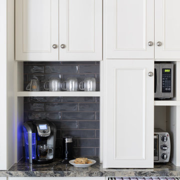
The owners of this kitchen had spent the money to upgrade the finishes in their kitchen upon building the home 12 years ago, but after living in the space for several years they realized how nonfunctional the layout really was. The (then) two preschool aged children had grown into busy, hungry teenagers with many friends who also liked to hang out at the house. So the family needed a more functional kitchen with better traffic flow, space for daily activities revolving around the kitchen at different times of day, and a kitchen that could accommodate cooking for and serving large groups. Furthermore, the dark, traditional finishes no longer reflected the homeowners’ style. They requested a brighter, more relaxed, coastal style that reflected their love of the seaside cities they like to visit.
Originally, the kitchen was U-shaped with a narrow island in the middle. The island created narrow aisles that bottle-necked at the dishwasher, refrigerator, and cooktop areas. There was a pass-through from the foyer into the kitchen, but the owners never liked that the pass-through was also located so close to the powder room. The awkward proximity was unappealing and made guests feel uncomfortable.
The kitchen’s storage was made up of lots of narrow cabinets, apothecary drawers, clipped corner units, and very few drawers. It lacked useful storage for the larger items the family used on a daily basis. And the kitchen’s only pantry was small closet that had only builder-grade, narrow shelving with no illumination to be able to see the contents inside.
Overall, the kitchen’s lighting plan was poorly executed. Only six recessed cans illuminated the entire kitchen and nook areas. The under cabinet lighting was not evenly distributed either. In fact, the builder had mis-placed the under cabinet lighting around the decorative pilasters which made for choppy, dark cubbies. Further, the builder didn’t include any lighting over the sink or the bar area, which meant whoever was doing the dishes was always in their own shadow. That, coupled with the steep overhang of the game room above made the bar area feel like a dim, cavernous space that wasn’t inviting or task oriented. The kitchen looked out into the main living space, but the raised bar and a narrow wall (which held the only large cabinet in the kitchen) created more of a barrier than a relationship to the living room or breakfast nook. In fact, one couldn’t even see the breakfast nook from the cooktop or sink areas due to its orientation. The raised bar top was too narrow to comfortably sit to either dine at or chat from due to the lack of knee space. The the homeowners confided that the kitchen felt more like a dark, dirty prison than place where the family, or their guests, wanted to gather and commune.
The clients' needs and desires were:
➢ to create a kitchen that would be a space the family loved to be in; to relate to the adjacent spaces all around, and to have better flow for entertaining large groups
➢ to remove the walls between the breakfast nook and living area and to be able to utilize the natural light from the windows in both those areas
➢ to incorporate a functional chopping block for prepping fresh food for home cooked meals, an island with a large sink and drain board, 2 pull out trash cans, and seating for at least the 2 teens to eat or do homework
➢ to design a kitchen and breakfast nook with an airy, coastal, relaxed vibe that blended with the rest of the house's coastal theme
➢ to integrate a layered lighting plan which would include ample general illumination, specific task lighting, decorative lighting, and lots of illuminated storage
➢ to design a kitchen with not only more storage for all the husband’s kitchen gadgets and collection of oils and spices, but smart storage, including a coffee/breakfast bar and a place to store and conceal the toaster oven and microwave
➢ to find a way to utilize the large open space between the kitchen, pantry area, and breakfast nook
Twelve Stones Designs achieved the owner's goals by:
➢ removing the walls between the kitchen and living room to allow the natural light to filter in from the adjacent rooms and to create a connection between the kitchen, nook, and living spaces for a sense of unity and communion
➢ removing the existing pantry and designing 3 large pantry style cabinets with LED tape lights and rollout drawers to house lots of kitchen appliances, gadgets, and tons of groceries. We also took the cabinets all the way up to the 9’ ceiling for additional storage for seasonal items and bulk storage.
➢ designing 2 islands - 1 with a gorgeous black walnut chopping block that houses a drawer for chopping and carving knives and a custom double pull out trash unit for point of use utilization - and 1 that houses the dishwasher, a large Blanco Gourmet sink with integrated drain board, woven baskets for fresh root vegetables and kitchen towels, plenty of drawer storage for kitchen items, and bar seating for up to 4 diners.
➢ closing off the space between the kitchen and the powder room to create a beautiful new private alcove for the powder room as well as adding some decorative storage. This also gave us space to include more tall storage near the new range for precision placement of the husband’s extensive oil and spice collection as well as a location for a combo-steam oven the wife wanted for baking and cooking healthy meals.
The project is enhanced functionally by:
➢ incorporated USB and standard receptacles for the kids’ laptops and phone charging in the large island
➢ designing the small island to include additional open shelving for items used on a daily basis such as a variety of bowls, plates, and colanders. This set up also works well for the husband who prefers to “plate” his dinners in restaurant-style fashion before presenting them to the table.
➢ the integration of specific storage units, such as double stacked cutlery drawers, a custom spice pull-out, a Kuerig coffee and tea pod drawer, and custom double stacked utensil drawers
➢ moving the refrigerator to the old oven location - this eliminated the bottle neck as well as created a better relationship to the eating table. It also utilizes the floor space between the pantry, nook, and kitchen
➢ creating a banquet style breakfast nook - this banquette seating not only doubles the amount of seating for large gatherings but it better utilizes the odd space between the kitchen and the previous nook area. It also helps to create a distinct pathway from the mudroom room through the pantry area, kitchen, nook, and living room.
➢ the coffee/breakfast bar area which includes the perfect location for the concealed microwave and toaster oven, convenient storage for the coffee pods and tea accoutrements. Roll-out drawers below also house the smoothie maker, hot water kettle, and a plethora of smoothie-making ingredients such as protein powders, smoothie additives, etc. Furthermore, the drawers below the Keurig house measuring utensil, cutlery, baking supplies and tupperware storage.
➢ incorporating lots of wide drawers and pullouts to accommodate large cookware.
➢ utilizing as much vertical space as possible by building storage to the ceiling which accommodates the family’s abundant amount of serving platters, baking sheets, bakeware, casserole dishes, and additional cutting boards.
The project is enhanced aesthetically by:
➢ new 5-piece Versailles pattern porcelain tile that now seamlessly joins the entire down stairs area together creating a bright, cohesiveness feeling instead of choppy separated spaces - it also adds a coastal feeling
➢ designing a cabinet to conceal the microwave and toaster oven
➢ the coastal influenced light fixtures over the nook table and island
➢ the sandy colors of the Langdon Cambria countertops. The swirling pattern and sparkling quartz pieces remind the homeowner of black-and-tan sandy beaches
➢ the striped banquet seating whose creamy white background and blue-green stripes were the inspiration for the cabinet and wall colors.
➢ All the interior doors were painted black to coordinate with the blacks and grays in the backsplash tile and countertop. This also adds a hint of tailored formality to an otherwise casual space.
➢ the use of WAC's Oculux small aperture LED units for the overhead lighting complimented with Diode LED strips for task lighting under the cabinets and inside the pantry and glass wall cabinets. All of the lighting applications are on separate dimmer switches.
Innovative uses of materials or construction methods by Realty Restoration LLC:
➢ Each 1-1/2” x 3” block of reclaimed end-grain black walnut that makes up the center island chopping block was hand milled and built in the shop. It was designed to look substantial and proportional to the surrounding elements, executed by creating the 4 inch tall top with a solid wood chamfered edge band.
➢ The metal doors on either side of the vent hood were also custom designed for this project and built in the Realty Restoration LLC shop. They are made 1x2, 11-gauge mild steel with ribbed glass. Weighing 60 lbs a piece, heavy duty cabinet hinges were added to support the weight of the door and keep them from sagging.
➢ Under-cabinet receptacles were added along the range wall in order to have a clean, uninterrupted backsplash.
Design obstacles to overcome:
➢ Because we were removing the demising walls between the kitchen and living room, we had to find a way to plumb and vent the new island. We did this by tunneling through the slab (the slab had post tension cables which prevented us from just trenching) to run a new wet vent through a nearby structural wall. We pulled the existing hot and cold lines between upper floor joists and ran them down the structural wall as well and up through a conduit in the tunnel.
➢ Since we were converting from wall overs to a gas range it allowed us to utilize the 220 feed for the wall ovens to provide a new sub panel for all the new kitchen circuits
➢ Due to framing deficiencies inherited from the original build there was a 1-1/2” differential in the floor-to-ceiling height over a 20 foot span; by utilizing the process of cutting and furring coupled with the crown moulding details on the cabinet elevations we were able to mask the problem and provide seamless transitions between the cabinet components.
Evidence of superior craftsmanship:
➢ uniquely designed, one-of-a-kind metal “X” end panels on the large island. The end panels were custom made in the Realty Restoration LLC shop and fitted to the exact dimensions of the island. The welding seams are completely indistinguishable - the posts look like they are cut from a single sheet of metal
➢ square metal posts on the small island were also custom made and designed to compliment and carry through the metal element s throughout the kitchen
➢ the beautiful, oversized end panels on the pantry cabinets which give the breakfast nook a tailored look
➢ integrating a large format 5 piece Versailles tile pattern to seamlessly flow from the existing spaces into the new kitchen space
➢ By constructing a custom cabinet that jogged around a corner we could not remodel (housing the entry way coat closet) we were able to camouflage the adjacent wall offset within the upper and lower cabinets. By designing around the existing jog in the structural walls we accomplished a few things: we were able to find the space to house, and hide, the microwave and toaster oven yet still have a clean cohesive appearance from the kitchen side. Additionally, the owners were able to keep their much needed coat closet and we didn’t have to increase the budget with unnecessary structural work.
Кухня с серым фартуком – фото дизайна интерьера класса люкс
1