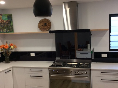
Not sure that I like the black glass splash back? Any suggestions?

Комментарии: 15

Tracy Oliver
Год(а)/Лет назад: 6Maybe a change in wall colour would soften the look. Your styling looks quite rustic / eclectic against all the black and white.
94236633
Год(а)/Лет назад: 6I agree with Julie, the chook pic and plate are at odds with the kitchen. I would place 3 small black and white or even another colour, pots with trailing plants to soften the look.
scottevie
Год(а)/Лет назад: 6I feel it is the harsh horizontal lines created by the contrast of the black splashback/white wall and then again with the floating shelf/range hood. Some good suggestions above with changing wall colour and trailing plants. Perhaps even repositioning the shelves lower (might be too $$ to patch up?) or another row of shelves just above splash back to soften transition from black to white.

Gallifrey
Год(а)/Лет назад: 6Can you get black power points? Would remove the contrast you currently have.

Karen Miller
Год(а)/Лет назад: 6Yes you can get black power points from the special orders counter at Bunnings, this is what we did when we put in our new kitchen with a black granite bench top. PRO
PROCollaroy Kitchen Centre
Год(а)/Лет назад: 6The black splashback looks great with your black handles and black window frames. Black power points would make such a difference. I would like the shelves to be same thickness as rangehood and could you remove the black trim on rangehood?
sarah_eddy6
Год(а)/Лет назад: 6First tip is to get black powerpoint covers! Then I think it just comes down to styling, everything else is really stylish!
To minimise the risk of black and white looking to stark, chose items in colours that 'bridge' the two - so soft grey tones. Something like a bit of marble with different tones will balance the 'blockiness' of the solid black & solid white.
To minimise the risk of it looking too slick and cold, add a bit of warmth & textural interest with a touch of cool-coloured timbers such as oak (i.e. not reddish/orange timber).
And finally, green foliage looks beautiful with black & white!
So I would just get a few things that add interest, these needn't be expensive:
A beautiful timber board - we found a lovely one at Ikea, otherwise the oak Georg Jensen cheeseboard is a splurge that looks beautiful but you'll use a lot too.
Something marble - possibly another board - Kmart & Freedom have some great inexpensive options.
Put some all white, interesting shaped pieces of crockery displayed on the timber shelf. Cookbooks may look too busy (and they might get sticky up there).
OR a cluster of small potted succulents there (if they survive!), even one that trails a little over the edge.

Julie Schipplock
Год(а)/Лет назад: 6It's quite nice, but a bit underwhelming, doesn't really do much for the kitchen, needs a.bit more warmth added, as other people have suggested.

Juliet Docherty
Год(а)/Лет назад: 6Последние изменения: Год(а)/Лет назад: 6Change the sockets for sure, but it's the white wall that is causing the problem, it contrasts too much with the black. I would paint the wall behind a tone in between black and white, something neutral with a tinge of colour, nothing strong.

Susan Ballard
Год(а)/Лет назад: 6Floating shelf wrong colour You need to style that shelf - some stainless cookware and b&w items Draw focus upwards PRO
PROTwinkle and Whistle
Год(а)/Лет назад: 6Последние изменения: Год(а)/Лет назад: 6I do like the lines created by the benchtop, the low splashback and the upper shelf. But the overall look is just a little too clinical, due to the high contrast between black and white. The stainless steel accentuates that too. Your timber shelf is on point though. All in all, nothing that some good styling can't fix :)
I would start by removing the items you currently have on your shelf, as they don't seem to belong to this new kitchen. As many commenter pointed out, I would also replace the powerpoint sockets with black ones. Finally, I would add "texture" to the space: a large rectangular cheese board made of timber and marble (not round, not rustic), a trailing plant, such as a pothos, some sleek ceramics of different sizes (vessels, jugs, mugs, etc). Adding bright colours will only enhance the sense of contrast, and will not soften up the room or the black, so I would stick to neutrals or very light colours: nude, taupe, light terracotta, sage green, etc. Black could also be added onto those shelves, but by small touches only: a couple of matt black mugs maybe, or a smallish B&W photo, in a larger timber frame, with a large white mat around it, to give it breathing space. I would not add any more stainless steel or chrome finish, as cold metallic shades will only enhance the sense of, well, coldness. Brass or copper could added, but again, by small amounts.
For some inspiration, look up some minimalist, Scandinavian kitchens with open shelving. Actually, your shelf doesn't have to be for kitchenware only. You can display all sorts of things (that won't be damaged by cooking grease, or that can be easily cleaned), so don't limit your search to pictures of kitchens!
Another way to upgrade your kitchen would be to add washable wallpaper on the section of wall between splashback and shelf. Depending on the style of your home, and depending on what you like, you could be adding:- an industrial touch (with a recycled bricks look, [like this one[(https://www.houzz.com.au/photos/aaron-and-megan-marrickville-contemporary-kitchen-sydney-phvw-vp~46088368) or [this one[(https://www.houzz.com.au/photos/glen-iris-residence-contemporary-dining-room-melbourne-phvw-vp~15444377) or even [that one[(https://www.houzz.com.au/photos/kitchen-transitional-kitchen-london-phvw-vp~22949355)
- a graphic [grey and white pattern[(https://www.houzz.com.au/photos/camp-hill-kitchen-feature-wallpaper-splashback-contemporary-kitchen-brisbane-phvw-vp~59346323)
- or, why not, some beautiful foliage
Good luck, have fun, and please, show us your progress!
Jason Treanor
Год(а)/Лет назад: 6Black PowerPoints and paint the wall black up to the shelf. Style with more Scandi, Minimalist wood items and a plant.Karen Miller
Год(а)/Лет назад: 6I think that I would incorporate a little bit of red or other bright colour to give a lift.


Julie Herbert