Take a Tour of Popular Colors Through the Decades
Journey back in time to see how culture and the economy have affected the colors of our homes

How does a palette get selected, and why does that particular palette become popular and define an era? Probably because color selection doesn't happen in a vacuum. Politics, economics and technology all influence what colors will be popular in a particular time. If there's an economic boom, the colors will likely be joyful and celebratory. If, on the other hand, there's an economic downturn, the chosen palette will more than likely be of more somber hues.
Let's take a look at how this has played out in the United States over the past 100 years.
Let's take a look at how this has played out in the United States over the past 100 years.
Even the simple kitchen took on the aesthetic of the laboratory. White walls, white cabinets and white appliances all contributed to an aesthetic that spoke to a clean, healthy and disease-free environment.
1930s. This decade would have to be characterized as lost to the Great Depression. With massive unemployment and an almost complete collapse of the building industry, it's a wonder any houses were built, especially one that has to be one of the most beautiful ever.
So the colors of this decade were forest greens, soft browns and yellows as well as Frank Lloyd Wright's favorite, Cherokee Red. See more of the colors of Fallingwater.
So the colors of this decade were forest greens, soft browns and yellows as well as Frank Lloyd Wright's favorite, Cherokee Red. See more of the colors of Fallingwater.
There was a countervailing color trend in the 1930s too, though. Go figure, but during the depths of the Great Depression there was a lot of optimism about the future. So streamlined buildings with polished chrome, stainless steel and other shiny surfaces, and flowing curves were also a design trend.
1940s. During the first half of this decade, much of the world was engaged in World War II. So it's not surprising that the colors Americans associate with that time are the red, white and blue of the U.S. flag. The stars and stripes were flying everywhere.
When the war ended and our servicemen and -women returned, Americans took to building a new 20th-century America. This America was a celebration of the future, with modern materials and designs. Chrome tubular chairs replaced overstuffed lounges, while curtains and blinds gave way to sheets of glass. The colors were sophisticated and rich; deep browns and ebony blacks against shiny metal ruled.
1950s. The era that embraced the charm and humor of the Cleavers and Lucy, created the interstate highway system and saw the fulfillment of the American dream in the suburban ranch house was an era of expansive joy. And if there was one thing that symbolized this, it had to be automobile tail fins on pastel-colored cars. If you have to ask what the tail fins were for, you're missing the point entirely.
Colors of the 1950s epitomized the optimism of the decade. I can still picture my parents' multigreen Pontiac Parisienne and my uncle's red Corvette. From mint greens to turquoise to soft and creamy yellows, our cars came in just about every pastel imaginable, it seems.
Colors of the 1950s epitomized the optimism of the decade. I can still picture my parents' multigreen Pontiac Parisienne and my uncle's red Corvette. From mint greens to turquoise to soft and creamy yellows, our cars came in just about every pastel imaginable, it seems.
1960s. From Haight-Ashbury to Piccadilly Circle, the Beatles to Peter Max, Woodstock to Selma, the decade of the 1960s was one of change, sometimes full of peace and love and sometimes disturbingly violent. It was a decade of taking sides and proclaiming, in the loudest possible terms, who you were.
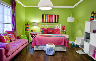
Colors from this decade were rich, deep, psychedelic hues, such as acid orange and neon pink. The title of one of my all-time-favorite books, The Kandy-Kolored Tangerine Flake Streamline Baby, sums up the approach to color for this decade.
Colors from this decade were rich, deep, psychedelic hues, such as acid orange and neon pink. The title of one of my all-time-favorite books, The Kandy-Kolored Tangerine Flake Streamline Baby, sums up the approach to color for this decade.
1970s. From Afros to disco, from Jaws to Star Wars, the 1970s was a time to be big and bold. As the Vietnam War came to an inglorious close, the shadow of Watergate loomed over politics and we waited in long lines to fill our gas tanks, the decade also had a dark side.
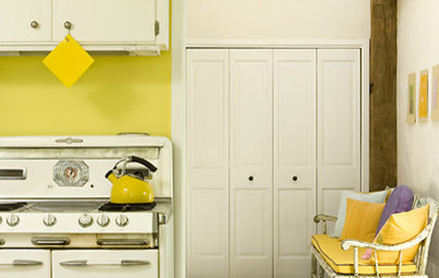
So at the same time that we had bold graphics and went large, we had a color palette of rusts, golds, greens and browns. But rather than taking their hue from the natural world, these colors were all a bit off, more man made, with just a hint of gray.
Who can forget all of those avocado green and harvest gold appliances?
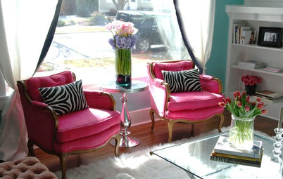
1980s. Reaganomics, David Bowie, MTV, the personal computer and the Space Shuttle are all emblematic of the economic boom during this decade. And with sumptuous films like The Last Emperor and Out of Africa as well as television shows such as Miami Vice, the 1980s was a visually stunning time.
The colors of the '80s have to be flamingo pink, Caribbean blue and lime green — bold, bright and brash colors that transported us to the tropics in a "go fast" boat.
The colors of the '80s have to be flamingo pink, Caribbean blue and lime green — bold, bright and brash colors that transported us to the tropics in a "go fast" boat.
And for those in a more conservative state of mind, who can forget Nancy Reagan red?
1990s. Cell phones, personal computers and the Internet meant that we were all more "connected" to one another at the dawn of the information age. A center of this new age was Seattle, home to many of the tech companies that would come to dominate the economics of the decade. And you can't mention Seattle without mentioning grunge and a sense of isolation and alienation just when we were all becoming more connected.
The colors of the decade included grays and a muted palette of reds, blues and greens and blues.
The colors of the decade included grays and a muted palette of reds, blues and greens and blues.
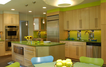
2000s. What a decade! Surely it was 10 years of one extreme after another. A dot-com bubble burst, two more wars started, cheap and easy credit allowed for irrational exuberance to take hold everywhere — and the party crashed.
While it seemed that every homeowner had to have the stainless steel professional-looking appliance package, and every home had to be large enough to accommodate a small village, there was also a strong counter movement toward smaller houses and less glitz.
If one thing does stick out, it's that all of those surfaces had to shine with a metallic glossiness. And that stainless steel was, in fact, the color of the decade.
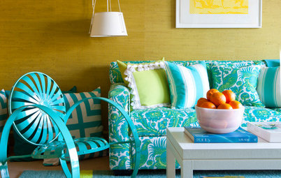
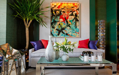
2010s. While we're still in the early years of the decade, we're already seeing some trends. A color trend is toward greens and blues. While these colors may have been deeply and richly toned not too long ago, today they are more subdued. Mixed with earthy neutrals, today's greens and blues are softer and less glitzy. That's not to say they're boring. While the colors may be softer and quieter, the finishes tend be shiny and opalescent, adding some glitz to the overall scheme.
For some, those muted earth colors, no matter what the finish, just don't do it. Pantone has had some forecasts color lovers appreciate, such as ...
For some, those muted earth colors, no matter what the finish, just don't do it. Pantone has had some forecasts color lovers appreciate, such as ...
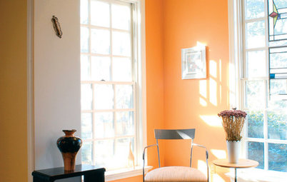
... Tangerine Tango in 2012. Recession and political gridlock be damned! A color like this will always put a smile on your face and jump-start your heart no matter what's going on elsewhere.
And Pantone picked Emerald for 2013: green and glitz all in one package.
Tell us: What colors do you think the 2010s will be remembered for?
Tell us: What colors do you think the 2010s will be remembered for?


The ideal color to portray that aesthetic was white. Pure, platonic and rational, this color came to symbolize the dawn of a new era in architecture. From Corbu to Mies to the present, modernism became synonymous with the white box.