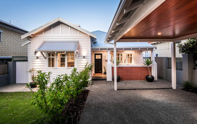
Houzz Tour: 3-Story 1970s House Gets a Cheerful Update
A full remodel of this London home packs in storage, retro style and a home office for a growing family

Not long after moving in, the owners of this three-story, 1970s home in London realized that it wasn’t set up for family life. “It was built in the late 1970s in a neo-Georgian style to replace a house that was destroyed in World War II,” says interior designer Lindsey Roberts, who was brought on board to work her magic. “The house was lovely, but it did not function as well as it could, so it required a full refurbishment.”
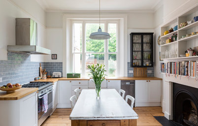
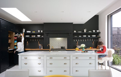
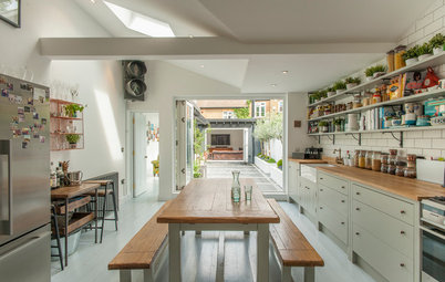
The kitchen area is practical and family-friendly. The owners’ oldest child can sit and draw at the breakfast bar while they cook, and the bar is two-tiered so that any mess in the cooking zone can’t be seen from the living area.
The owners love the midcentury modern look, so they used accents of golden yellow, aqua and orange. “Their preference is for a midcentury modern aesthetic, but for the units, we decided on a Shaker style,” Roberts says.
Hex pendant lights: Mullan Lighting; Ammonite paint on kitchen cabinets: Farrow & Ball
To give the Shaker-style cabinets a modern edge, Roberts chose bright blue tiles for the backsplash and honeycomb-shaped tiles for the floor.
“Everyone loves the tiles” on the backsplash and the floor, Roberts says. “The floor tiles have a traditional feel but are also very on-trend with the honeycomb pattern.”
Retro Metro wall tile in Green Park: Fired Earth; Victorian floor tile: Original Style
A Dozen Ways to Work In Patterned Tile
“Everyone loves the tiles” on the backsplash and the floor, Roberts says. “The floor tiles have a traditional feel but are also very on-trend with the honeycomb pattern.”
Retro Metro wall tile in Green Park: Fired Earth; Victorian floor tile: Original Style
A Dozen Ways to Work In Patterned Tile
The Smeg fridge-freezer was the starting point for the kitchen’s design concept.
“The owners loved its retro charm and wouldn’t be swayed to look at any other models,” Roberts says. “I’m glad they didn’t, as it works really well.”
A built-in pantry keeps this family kitchen orderly.
“The owners loved its retro charm and wouldn’t be swayed to look at any other models,” Roberts says. “I’m glad they didn’t, as it works really well.”
A built-in pantry keeps this family kitchen orderly.
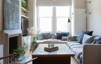
The dining area is Roberts’ favorite part of the project.
“It’s a small corner that was so cold, but now it’s a warm and inviting place to eat, and also a space where the little ones can play,” she says.
Oval Room Blue paint on feature wall: Farrow & Ball; pendant light: Dwell
“It’s a small corner that was so cold, but now it’s a warm and inviting place to eat, and also a space where the little ones can play,” she says.
Oval Room Blue paint on feature wall: Farrow & Ball; pendant light: Dwell
The dining area’s built-in bench, designed by Forrester Roberts, maximizes every inch of space.
“Loose furniture wouldn’t have worked so well, and the bench is also great for storing children’s toys,” Roberts says.
An eclectic mix of dining chairs in a midcentury modern style adds interest to the room.
Fjord dining table: Made.com
10 Foolproof Ways to Mix Up Your Dining Chairs
“Loose furniture wouldn’t have worked so well, and the bench is also great for storing children’s toys,” Roberts says.
An eclectic mix of dining chairs in a midcentury modern style adds interest to the room.
Fjord dining table: Made.com
10 Foolproof Ways to Mix Up Your Dining Chairs
The open-plan space also has understairs shoe storage — a boon for this busy family.
Whereas a wall was knocked down on the ground floor to create the open-plan living space, this wall, complete with feature window, was added. Originally, this stairwell led directly into the second living room on the second floor.
“The circular window was the owners’ idea, but we helped to ensure that the right style and size was chosen,” Roberts says.
“The circular window was the owners’ idea, but we helped to ensure that the right style and size was chosen,” Roberts says.
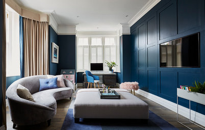
And that wasn’t the only wall that went up in this area. The wall next to the one with the round window was added to create an L-shaped room with an alcove for a home office. The functional yet stylish workspace is well-organized, with a cork wall and a shelving system for storage.
Cork tile: Walls and Floors; shelving system and desk: Ikea; Winona chair (left): Made.com; white chair (right): Miliboo
Cork tile: Walls and Floors; shelving system and desk: Ikea; Winona chair (left): Made.com; white chair (right): Miliboo
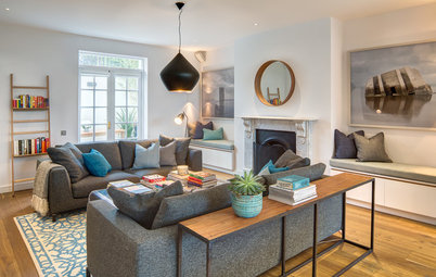
A blue sofa bed at the other end of the L-shaped living room makes this smart space a part-time guest room.
The living room has a distinct midcentury modern aesthetic thanks to touches like the wood pendant light and the lithograph by John Hultberg — a wedding present from one of the owners’ parents.
Fraser fabric on sofa bed: John Lewis; coffee table and chest of drawers: Made.com; Skipper pendant light by Tom Raffield: Heal’s
Also on this floor is this shower room, which was originally an en suite connecting to the second-floor bedroom. “As the bedroom … is now a nursery for the owners’ youngest child, we decided that a separate shower room would be far more practical,” Roberts says.
The geometric tiles give the space a Moorish feel. “The tiles appealed to the owners’ taste for artisan crafts, and they work well in a small space like this,” Roberts says. “The pattern draws the eye to the back of the room, making the tight space feel bigger.”
Oval Room Blue paint on walls: Farrow & Ball; tile: Walls and Floors
A loose orange-and-blue color scheme flows throughout the house for a harmonious look.
The owners discovered that they were expecting their second child during the course of the renovation, so a planned guest bedroom was hastily changed into a nursery.
“The timing of the project became all the more important,” Roberts says. “And the end result is that a house became a home to a very happy family. Their home now reflects their personal style — light, fresh, warm and inviting.”
“The timing of the project became all the more important,” Roberts says. “And the end result is that a house became a home to a very happy family. Their home now reflects their personal style — light, fresh, warm and inviting.”
Wall stickers decorate the nursery. They can easily be changed when a new look is required.
Wall stickers: Parkins Interiors
Wall stickers: Parkins Interiors
The main bedroom, on the top floor, has a different aesthetic from the rest of the house. “The owners had collected a number of beautiful and interesting pieces from around the world, some with deep sentimental value, so we tried to incorporate as many as we could,” Roberts says.
The focal point is the Japanese screen, which the owners inherited from a grandmother who had brought it back from her travels in Japan.
Bedding and pillows: John Lewis
The focal point is the Japanese screen, which the owners inherited from a grandmother who had brought it back from her travels in Japan.
Bedding and pillows: John Lewis
Custom closets provide lots of storage in the main bedroom and contribute to the room’s Asian style. “They are veneered in an olive-toned, stained ash and lacquered to highlight the beautiful deep grain,” Roberts says.
Also on the top floor is the older child’s bedroom. Vibrant accessories create a welcoming space.
“The owners wanted a bedroom to match their little girl’s bright and sunny disposition, with a preference for strong colors,” Roberts says. “She needed a space to draw, to read and to play. The room also needed to adapt as she grows.”
“The owners wanted a bedroom to match their little girl’s bright and sunny disposition, with a preference for strong colors,” Roberts says. “She needed a space to draw, to read and to play. The room also needed to adapt as she grows.”
The cabinets were designed by Forrester Roberts and built by a local firm the company uses time and time again.
Doorknobs from Anthropologie lift the neutral color scheme, as do the eclectic pillows.
Pillows: Wayfair and All Things Brighton Beautiful
Browse more homes by style: Apartments | Barn Homes | Colorful Homes | Contemporary Homes | Eclectic Homes | Farmhouses | Floating Homes | Guesthouses | Homes Around the World | Lofts | Midcentury Homes | Modern Homes | Ranch Homes | Small Homes | Townhouses | Traditional Homes | Transitional Homes | Vacation Homes

Houzz at a Glance
Who lives here: A professional couple with a young daughter and a newborn baby
Location: Greenwich, London
Size: Three bedrooms, 2½ bathrooms
Designer: Lindsey Roberts, owner of Forrester Roberts Interior Design
A well-functioning house is key to managing a busy lifestyle, especially for a young family with changing needs. “Overall, the owners wanted a welcoming family home filled with natural light, lots of practical storage and also a quiet workspace, as one of the owners works almost exclusively from home,” Roberts says.
The first area to be tackled was the ground floor, which originally consisted of a small kitchen and a separate living room. “The original kitchen was cramped — not ideal with a small child — and the back of the house, where the kitchen is, faces northwest, which meant it was very dark in the mornings,” she says.
The solution was to remove the wall between the two rooms. This created an open-plan kitchen, living and dining space totaling about 430 square feet (40 square meters), and allowed the southeasterly light to flood in, particularly in the mornings.