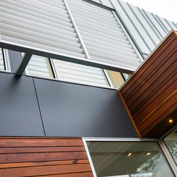
Junction of finishes.
Spotted Gum, Glass, Matrix Panels in Dulux Domino, Titanium Zinc, Aluminium Louvres.
Photography by Rachel Lewis.
На фото: идея дизайна в современном стиле с
На фото: идея дизайна в современном стиле с
Marilynn Kay
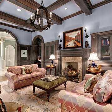
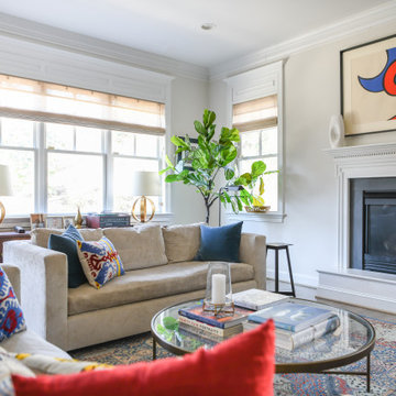
На фото: изолированная гостиная комната:: освещение в классическом стиле с с книжными шкафами и полками, серыми стенами, паркетным полом среднего тона и стандартным камином с
На фото: изолированная гостиная комната:: освещение в классическом стиле с с книжными шкафами и полками, серыми стенами, паркетным полом среднего тона и стандартным камином с
The Little River Cabin is the perfect small mountain or lake getaway. The small footprint of the cabin makes it affordable. The open layout and wraparound porches make this small home live large.The kitchen, dining area, and family room are all part of one open vaulted space. The family room has a stone fireplace and access to the wraparound porches that enjoy views on two sides of the house. The master suite has a large vanity big enough for one or two sinks. The master bath is layed out so that you can include a walk in shower or a soaking tub and separate smaller shower. A half bath, pantry, and laundry closet complete the mian level.The upper level includes a spacious bedroom and a private bath. The area above the family room can be floored to add a third bedroom.The optional lower level or basement can be finished to include a recreation room, two bunk rooms, and a full bath.
The exterior of the Little River Cabin is a mixture of stone and board and batten siding. The screened porch and wraparound porch connect you with the outdoors. The wraparound porch gives you the ability to rotate the house on the site in different ways to take maximum advantage of the views.
Find the right local pro for your project
kazart photography
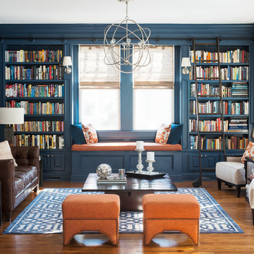
Свежая идея для дизайна: гостиная комната в стиле неоклассика (современная классика) с с книжными шкафами и полками, синими стенами и паркетным полом среднего тона без телевизора - отличное фото интерьера
Свежая идея для дизайна: гостиная комната в стиле неоклассика (современная классика) с с книжными шкафами и полками, синими стенами и паркетным полом среднего тона без телевизора - отличное фото интерьера
This eclectic family room does everything right. The original artwork by Alexander Calder was the jumping off point for the design. Pulling in primary colors with the stunning oriental rug and Turkish velvet throw pillows makes this space come together perfectly.
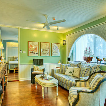
Источник вдохновения для домашнего уюта: большая открытая гостиная комната в морском стиле с белыми стенами, светлым паркетным полом, мультимедийным центром, бежевым полом, потолком из вагонки и деревянными стенами
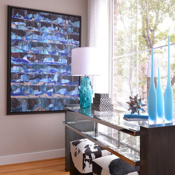
In front of a large open window in the living space, we chose to place a contemporary glass console table with two cowhide poufs below for extra seating. The bright turquoise abstract art brings the space to life with color.
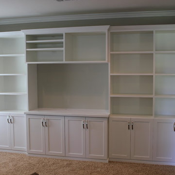
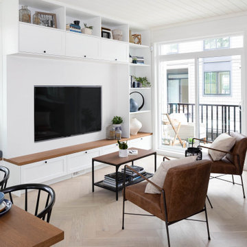
When sitting down with this client it was important that the wall unit would suit the needs of the parents and kids alike since this was in a family room. The end result was a beautiful clean wall unit that would house a 46" televisions and components as well as books, toys and decorative items.
It was important to the homeowner that the color be very clean and inline with all of the trim which was white. House of Closets incorporated 4 1/2" crown moldings, 2 1/2" base moldings, shaker doors to really dress up the unit and beautiful handles to finish off the entire look.
The photos were taken by Ron Hever, director of sales at House of Closets. All photos are the sole property of House of Closets and may not be used or copied by anyone for advertising or marketing puposes.
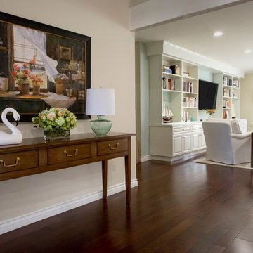
From the main entryway the home opens up into a large living room with high ceilings. The floor plan is open to the dining room and family room with views all the way to the backyard and side gardens. The room features a weathered wood fireplace and ceiling with white beams, which set the stage for the beach theme throughout the home. A blue crackle glass lamp sits at the entry table under a large piece of the client’s artwork collection.
Photo Credit: Stephanie Swartz
For this couple, planning to move back to their rambler home in Arlington after living overseas for few years, they were ready to get rid of clutter, clean up their grown-up kids’ boxes, and transform their home into their dream home for their golden years.
The old home included a box-like 8 feet x 10 feet kitchen, no family room, three small bedrooms and two back to back small bathrooms. The laundry room was located in a small dark space of the unfinished basement.
This home is located in a cul-de-sac, on an uphill lot, of a very secluded neighborhood with lots of new homes just being built around them.
The couple consulted an architectural firm in past but never were satisfied with the final plans. They approached Michael Nash Custom Kitchens hoping for fresh ideas.
The backyard and side yard are wooded and the existing structure was too close to building restriction lines. We developed design plans and applied for special permits to achieve our client’s goals.
The remodel includes a family room, sunroom, breakfast area, home office, large master bedroom suite, large walk-in closet, main level laundry room, lots of windows, front porch, back deck, and most important than all an elevator from lower to upper level given them and their close relative a necessary easier access.
The new plan added extra dimensions to this rambler on all four sides. Starting from the front, we excavated to allow a first level entrance, storage, and elevator room. Building just above it, is a 12 feet x 30 feet covered porch with a leading brick staircase. A contemporary cedar rail with horizontal stainless steel cable rail system on both the front porch and the back deck sets off this project from any others in area. A new foyer with double frosted stainless-steel door was added which contains the elevator.
The garage door was widened and a solid cedar door was installed to compliment the cedar siding.
The left side of this rambler was excavated to allow a storage off the garage and extension of one of the old bedrooms to be converted to a large master bedroom suite, master bathroom suite and walk-in closet.
We installed matching brick for a seam-less exterior look.
The entire house was furnished with new Italian imported highly custom stainless-steel windows and doors. We removed several brick and block structure walls to put doors and floor to ceiling windows.
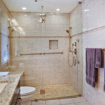
A full walk in shower with barn style frameless glass doors, double vanities covered with selective stone, floor to ceiling porcelain tile make the master bathroom highly accessible.
The other two bedrooms were reconfigured with new closets, wider doorways, new wood floors and wider windows. Just outside of the bedroom, a new laundry room closet was a major upgrade.
A second HVAC system was added in the attic for all new areas.
The back side of the master bedroom was covered with floor to ceiling windows and a door to step into a new deck covered in trex and cable railing. This addition provides a view to wooded area of the home.
By excavating and leveling the backyard, we constructed a two story 15’x 40’ addition that provided the tall ceiling for the family room just adjacent to new deck, a breakfast area a few steps away from the remodeled kitchen. Upscale stainless-steel appliances, floor to ceiling white custom cabinetry and quartz counter top, and fun lighting improved this back section of the house with its increased lighting and available work space. Just below this addition, there is extra space for exercise and storage room. This room has a pair of sliding doors allowing more light inside.
The right elevation has a trapezoid shape addition with floor to ceiling windows and space used as a sunroom/in-home office. Wide plank wood floors were installed throughout the main level for continuity.
The hall bathroom was gutted and expanded to allow a new soaking tub and large vanity. The basement half bathroom was converted to a full bathroom, new flooring and lighting in the entire basement changed the purpose of the basement for entertainment and spending time with grandkids.
Off white and soft tone were used inside and out as the color schemes to make this rambler spacious and illuminated.
Final grade and landscaping, by adding a few trees, trimming the old cherry and walnut trees in backyard, saddling the yard, and a new concrete driveway and walkway made this home a unique and charming gem in the neighborhood.
While the owners are away the designers will play! This Bellevue craftsman stunner went through a large remodel while its occupants were living in Europe. Almost every room in the home was touched to give it the beautiful update it deserved. A vibrant yellow front door mixed with a few farmhouse touches on the exterior provide a casual yet upscale feel. From the craftsman style millwork seen through out, to the carefully selected finishes in the kitchen and bathrooms, to a dreamy backyard retreat, it is clear from the moment you walk through the door not a design detail was missed.
Being a busy family, the clients requested a great room fit for entertaining. A breakfast nook off the kitchen with upholstered chairs and bench cushions provides a cozy corner with a lot of seating - a perfect spot for a "kids" table so the adults can wine and dine in the formal dining room. Pops of blue and yellow brighten the neutral palette and create a playful environment for a sophisticated space. Painted cabinets in the office, floral wallpaper in the powder bathroom, a swing in one of the daughter's rooms, and a hidden cabinet in the pantry only the adults know about are a few of the elements curated to create the customized home my clients were looking for.
---
Project designed by interior design studio Kimberlee Marie Interiors. They serve the Seattle metro area including Seattle, Bellevue, Kirkland, Medina, Clyde Hill, and Hunts Point.
For more about Kimberlee Marie Interiors, see here: https://www.kimberleemarie.com/
To learn more about this project, see here
https://www.kimberleemarie.com/bellevuecraftsman
Designed by: Studio Revolution
Photography by: Thomas Kuoh
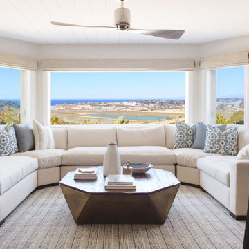
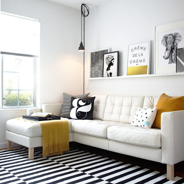
На фото: гостиная комната в скандинавском стиле с белыми стенами и ковровым покрытием
На фото: гостиная комната в скандинавском стиле с белыми стенами и ковровым покрытием
Our clients wanted to finish the walkout basement in their 10-year old home. They were looking for a family room, craft area, bathroom and a space to transform into a “guest room” for the occasional visitor. They wanted a space that could handle a crowd of young children, provide lots of storage and was bright and colorful. The result is a beautiful space featuring custom cabinets, a kitchenette, a craft room, and a large open area for play and entertainment. Cleanup is a snap with durable surfaces and movable storage, and the furniture is easy for children to rearrange. Photo by John Reed Foresman.
Designed by Supakit Tharawiwat, Tharabar, Indese and Industique Furniture
Пример оригинального дизайна: изолированная гостиная комната в классическом стиле с зелеными стенами
Пример оригинального дизайна: изолированная гостиная комната в классическом стиле с зелеными стенами
This beautiful North Vancouver home belongs to a nature-loving and health-conscious couple, Emma and Vince (names changed), their two young children, and their dog, Jasper. When they contacted us about renovating and furnishing their kitchen and family room, we walked in and saw a world of potential waiting to be uncovered.
Before: Larkhall Crescent Home:
Like many original North Vancouver homes, the interior was definitely dated. We encountered late ‘80s finishes in powder pink and teal green, old carpet, and a kitchen that wasn’t maximized to suit this family’s modern-day lifestyle. However, the size of the rooms offered us a ton of space with which to get creative.
Knowing our clients’ love of cooking, need for work spaces (Emma and Vince both work remotely), and growing family, we developed a design concept that would increase usable space, optimize storage, and create intimacy in this large area. As for the style, we were inspired by their European roots, inventing a new and modern take on “Belgian Farmhouse” style. Now, the home is truly one-of-a-kind.
After: Warm & Cozy Family Room:
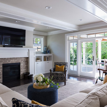
Fresh, bright, and comfortable, this living area has been transformed! We started with the fireplace as a focal point, selecting aged brick tiles for added texture and a crisp wood mantle. The taupe-coloured sectional infuses the room with visual warmth and serves the added purpose of separating the family room from the kitchen.
Emma and Vince were also keen on using non-toxic materials in their home, and we were happy to oblige. To meet their needs, we sourced natural wood elements and sought out Canadian-made products - that adhere to high health standards - whenever possible.
Look closer at the elements of this space, and you will find this stunning, honeycomb-patterned rug in earthy gold, beige, and charcoal tones. It’s plush to the touch and full of visual texture that brings this room’s colour palette together. We sourced these two-tone chairs with caning, petrified wood side table, black sconces, and botanical prints in greyscale from local artist, Heather Johnston.
We topped off the space with this dark wood and rattan console that offers storage facing the kitchen and presents an opportunity to display cherished items. The result is a cozy lounging space brimming with comfort and functionality. It’s perfect for enjoying quality family time, or Emma can simply slide the coffee table away to make room for her morning yoga practice.
Now, let’s turn around and give some attention to the kitchen. Do you remember what the original kitchen looked like? If not, scroll back up, because the transformation is shocking…
Moody & Welcoming Kitchen for Healthy Living:
This kitchen looks very different from how it started, right? Though we didn’t touch any walls, the kitchen has almost doubled in usable space! We created a long, extended island with storage, an outlet for small appliances, and seating for comfortable prep, after-school snacking, or mingling among friends.
On the other side of the island, the family has even more storage and an integrated dishwasher within easy reach of the sink, perfect for quick clean-up. From this angle, you can also see the expansive custom Shaker cabinetry in white and the integrated double ovens. These facilitate their cooking experience and gave us the opportunity to add an additional surprise…
A coffee garage station and more hidden storage! Keeping these items located along the perimeter allows them to be accessed by the family or their guests without someone getting under the cook’s feet. These are the little details that make everyday life easier and more enjoyable.
Moving deeper into the kitchen, the seamless induction cooktop topped with a freestanding concealed hood fan commands attention in a soft yet prominent way. The natural wood accent mirrors the fireplace mantle, and the choice of off-black wood-grain cabinets not only continues our black-and-white colour palette but adds a sense of depth and contrast. The corner sink is located to the right and perfectly positioned with a view of their thriving backyard.
To invite more of this family’s character into the space, we mixed metals for interest — matte black, dark pewter, and warm brass — and created open shelves in white oak for their plants and decor. You can also glimpse the tumbled edge of the backsplash tile, which echoes the rustic brick of the fireplace. It adds that farmhouse charm while still feeling timeless and sophisticated.
Last but not least, we designed this dining banquette in the bay window (with integrated bench storage, of course), where the family can share a meal together, the kids can do homework, or Emma and Vince can work and enjoy a change of scenery from their offices. Like the other spaces in the home, it was designed to be beautiful, multi-functional, and long-lasting.
Praise from Our Clients:
It is clear that we love this home, but what did our clients have to say?
“Lori is a visionary and masters execution to the finest detail all at the same time. When she first met us to know more about who we are and how we live, she could right away envision how we could use the space in our kitchen and living room…The results exceeded our expectations.
Lori and her team were also a delight to work with — coordination with all the trades, fast problem-solving, regular updates, professional and friendly attitude of her entire team — made it the dream team. Thank you SHD for making our space so beautiful!”
In turn, we are so grateful for this family’s trust, their open communication, and for being wonderful people with whom to work. (So, thank you!)
This beautiful North Vancouver home belongs to a nature-loving and health-conscious couple, Emma and Vince (names changed), their two young children, and their dog, Jasper. When they contacted us about renovating and furnishing their kitchen and family room, we walked in and saw a world of potential waiting to be uncovered.
Before: Larkhall Crescent Home:
Like many original North Vancouver homes, the interior was definitely dated. We encountered late ‘80s finishes in powder pink and teal green, old carpet, and a kitchen that wasn’t maximized to suit this family’s modern-day lifestyle. However, the size of the rooms offered us a ton of space with which to get creative.
Knowing our clients’ love of cooking, need for work spaces (Emma and Vince both work remotely), and growing family, we developed a design concept that would increase usable space, optimize storage, and create intimacy in this large area. As for the style, we were inspired by their European roots, inventing a new and modern take on “Belgian Farmhouse” style. Now, the home is truly one-of-a-kind.
After: Warm & Cozy Family Room:
Fresh, bright, and comfortable, this living area has been transformed! We started with the fireplace as a focal point, selecting aged brick tiles for added texture and a crisp wood mantle. The taupe-coloured sectional infuses the room with visual warmth and serves the added purpose of separating the family room from the kitchen.
Emma and Vince were also keen on using non-toxic materials in their home, and we were happy to oblige. To meet their needs, we sourced natural wood elements and sought out Canadian-made products - that adhere to high health standards - whenever possible.
Look closer at the elements of this space, and you will find this stunning, honeycomb-patterned rug in earthy gold, beige, and charcoal tones. It’s plush to the touch and full of visual texture that brings this room’s colour palette together. We sourced these two-tone chairs with caning, petrified wood side table, black sconces, and botanical prints in greyscale from local artist, Heather Johnston.
We topped off the space with this dark wood and rattan console that offers storage facing the kitchen and presents an opportunity to display cherished items. The result is a cozy lounging space brimming with comfort and functionality. It’s perfect for enjoying quality family time, or Emma can simply slide the coffee table away to make room for her morning yoga practice.
Now, let’s turn around and give some attention to the kitchen. Do you remember what the original kitchen looked like? If not, scroll back up, because the transformation is shocking…
Moody & Welcoming Kitchen for Healthy Living:
This kitchen looks very different from how it started, right? Though we didn’t touch any walls, the kitchen has almost doubled in usable space! We created a long, extended island with storage, an outlet for small appliances, and seating for comfortable prep, after-school snacking, or mingling among friends.
On the other side of the island, the family has even more storage and an integrated dishwasher within easy reach of the sink, perfect for quick clean-up. From this angle, you can also see the expansive custom Shaker cabinetry in white and the integrated double ovens. These facilitate their cooking experience and gave us the opportunity to add an additional surprise…
A coffee garage station and more hidden storage! Keeping these items located along the perimeter allows them to be accessed by the family or their guests without someone getting under the cook’s feet. These are the little details that make everyday life easier and more enjoyable.
Moving deeper into the kitchen, the seamless induction cooktop topped with a freestanding concealed hood fan commands attention in a soft yet prominent way. The natural wood accent mirrors the fireplace mantle, and the choice of off-black wood-grain cabinets not only continues our black-and-white colour palette but adds a sense of depth and contrast. The corner sink is located to the right and perfectly positioned with a view of their thriving backyard.
To invite more of this family’s character into the space, we mixed metals for interest — matte black, dark pewter, and warm brass — and created open shelves in white oak for their plants and decor. You can also glimpse the tumbled edge of the backsplash tile, which echoes the rustic brick of the fireplace. It adds that farmhouse charm while still feeling timeless and sophisticated.
Last but not least, we designed this dining banquette in the bay window (with integrated bench storage, of course), where the family can share a meal together, the kids can do homework, or Emma and Vince can work and enjoy a change of scenery from their offices. Like the other spaces in the home, it was designed to be beautiful, multi-functional, and long-lasting.
Praise from Our Clients:
It is clear that we love this home, but what did our clients have to say?
“Lori is a visionary and masters execution to the finest detail all at the same time. When she first met us to know more about who we are and how we live, she could right away envision how we could use the space in our kitchen and living room…The results exceeded our expectations.
Lori and her team were also a delight to work with — coordination with all the trades, fast problem-solving, regular updates, professional and friendly attitude of her entire team — made it the dream team. Thank you SHD for making our space so beautiful!”
In turn, we are so grateful for this family’s trust, their open communication, and for being wonderful people with whom to work. (So, thank you!)
In brief
Location, location, location
When looking for your perfect home where you can put down your grass roots and start a family there are many ‘must haves’ that we all have on our wish lists. The obvious contenders are price and location with many other niceties, like the number of bedrooms, layout and decor taking a back seat. As we all know, location can sell a home to those who strive to be in the right area, for transport links, local amenities and the all-important school catchment areas.
Like many other families throughout the UK our clients chose their house for its excellent location. Just ten minutes from the centre of Stafford by car, our client’s house is in a popular and sought-after suburb of the town for couples and families alike. They have always loved the location of their house for its easy access to work, schools, leisure facilities and social connections, but they were becoming increasingly frustrated with the layout of the ground floor of their home.
It’s inevitable that families will evolve and our needs from our properties will change too. Since the young family of four moved to their large four-bedroom detached house a few years ago, their property has been unable to meet their lifestyle needs and living patterns.
Although their property has adequate bedroom space for them and their two children, the layout of the downstairs living area was not functional and it obstructed their everyday life, making entertaining and family gatherings difficult.
Our First Meeting
Upon our initial consultation with our clients it was clear from the outset why they sought to make changes to the layout of their house. The property had been extended to create extra space by the previous owners, but unfortunately the design and build hadn’t been executed well at all. The rooms and layout were awkward in size and shape and it didn’t allow the family to come together and enjoy their home. They had the floor space, but it was sectioned off into separate rooms, some without a purpose.
The garden surrounds the house on all three sides and is of a good size in its entirety with different areas on each aspect. We could clearly see that the house itself didn’t address any particular aspect of the garden in any way.
Moving to a new house wasn’t an option, the family were happy with the location and size of the property. What they wanted was a modern, functional, stylish space for everyday family life, with the flexibility to accommodate their large extended family when needed and to ultimately add value to their property.
We were appointed by our clients to create a design solution to redesign the ground floor living area with a modern, light filled, open plan space that connects with the garden. It was clear from outset that our design intention was to break down the room barriers and to respond to the needs of the family, supporting their lifestyle now and for the future, bringing them together and creating a house they could call a home.
Delivering a project on time and within our client’s budget are always a top priority for our team. The family decided to stay in their house during construction, therefore it was even more essential to minimise the level of disruption to their daily lifestyle with a young family living on site.
The family needed help from our team at Croft Architecture to swiftly and successfully acquire Building Control Approval for their project to progress rapidly, ensuring project completion on time and to their determined budget.
Our Approach
Surveying the site
The client’s home is located on the entrance to a quiet cul-de-sac on a mature, leafy, suburban housing estate. Their home nestles into its well-established site, with ample space between the neighbouring properties and has considerable garden space to the rear and both sides.
During our initial visit we spent a long time with the family observing the existing layout, talking about how they currently live in the property, their annoyances with the house in its current form, how they would like to be able to live in their family home and how they aspired it to feel, look and live.
We walked through the house and it was clear that the existing layout didn’t work downstairs. The house had been extended onto before they had bought the property and the space hadn’t been well thought through in terms of how it would be used effectively.
The rooms directly to the left off the hallway, didn’t really have a proper function. The previously extended space had resulted in the house with too many rooms and subsequently this had led to a series of impractical spaces.
The long and narrow extension was home to a small U-shaped kitchen at the front of the house, which led onto the dining area and then onto a small room at the back of the extension. For the size of the house the kitchen and dining room in a much smaller and narrower area, leaving larger living areas to the rear of property with copious amounts of dead space. The small kitchen was tucked away at the front of the property which made life difficult for our clients to observe their children playing safely in the garden whilst preparing food and carrying out work in the kitchen. On the opposite side of the property there was another old extension which had a step down into it. This living area had a tiled floor and large glazed windows on all sides which made it feel almost like a conservatory.This area was rarely used by the family as it had no real function, plus it was hot in the summer and cold in the winter. It had become an under utilised space.
We walked around the property and it was clear that the house itself didn’t address their private garden space to any particular aspect in any way, meaning that the garden space was under used because of the poor connections.
The family wanted a combined kitchen, dining, lounge space for daily life and also for entertaining their family.
Design Approach
The size of the property presented the opportunity to substantially reconfigure the family home to create a series of dynamic living spaces oriented towards the large, south-facing garden.
Our team suggested removing the little kitchen from the front of the property and re positioning it within the unused glazed space at the back of the house.
The glazed room had internal French doors with a step down into the space separating it from the lounge. We proposed to remove the French doors, level the floor and make it into one room with the existing lounge.
To connect the new open plan kitchen and living space to the rear and side garden sliding and folding doors were the solution, extending the family’s usable living space by creating a seamless indoor-outdoor flow. There was already a patio area there and it made sense for the kitchen to move to the rear of the house to be close to the patio for easy outside dining.
It was therefore logical to retain the existing living space in it's current location next to the new kitchen, maintaining the natural flow of the house for the family after eating and entertaining in the kitchen.
When making decisions regarding the kitchen design, we worked closely with the family. They thoroughly enjoy spending time cooking and entertaining with their large extended family. To assist with their culinary preparations our clients had aspired to have an induction hob within their new kitchen. As they were working through the design with us, they weren’t sure about an induction hob because of different cooking methods required for certain meals that they like to produce. They particularly like making chapatis which require a round pan and a gas hob. We didn’t see this as a problem and suggested having a single gas burner for purely this purpose whilst still installing an induction hob. They decided to go ahead with our idea, choosing a single gas burner and an induction hob, and it looks great!
The existing lounge space had a corner aspect at the rear property that protruded into the garden. Positioned next to the kitchen and dining space it seemed logical to us for the living area to also open out onto the patio, thus connecting the garden to the house on a wider aspect. To enhance the connection between the garden and the living room we thought that a corner door would work extremely well to really open up this space. The clients really liked the design concept to create a feature of the corner with glazed sliding doors that would completely open the house up to the garden. They were excited about the prospect of the allowing huge amounts of natural light into their home and the flexible access it would provide to the garden.
Once the new kitchen, dining and living space had been concluded, we then had to consider what the previous kitchen and dining area was going to be used for within the small, long side extension. We talked with our clients about a few possible uses. We noticed that the family have a piano and few other musical instruments. It made sense for this space to become a quiet part of the house for them to escape to, play music, read and generally relax in a snug area.
To shorten the length of the new music room and make an additional feature in the newly created open plan kitchen, dining and living area, we reclaimed some of the space from the back of the side extension and opened it up to the main open-plan space, thus creating another new snug. We added an additional design feature within the snug by creating a timber window seat. Not only does it provide extra seating, but it’s also created a snug within a snug, a haven for reading, napping and gazing out into the garden.
As part of their brief our clients also wanted a to incorporate a log burner into their newly remodelled home. To connect the new music room and snug to the living space we proposed to position a two-way log burner where the existing gas fire was located. By retaining a fire in the original location it would minimise the disruption and work required to install the wood burner. However, the theory didn’t turn into reality and the new fire resulted in being quite a task to get it to work. When the contractor began to strip back the existing fireplace, they discovered that fitting the pipe within the building was going to be more challenging than they anticipated because of the poorly constructed extension. It was difficult to execute but it was ultimately achieved.
What lies beneath?
It’s not until you uncover the fabric of the building that you fully understand what’s going on underneath. When the contractor exposed the structure of the house, we found out that the property had been poorly constructed, and they uncovered a lot of poor workmanship from the original builders. As the build progressed the inner skin of the extended structure was exposed, we found that it wasn’t actually strong enough and we needed to make it safe in order to proceed. Going forwards we ensured that the structure was safe, and all issues were identified and immediately rectified.
The previous extensions to the house also presented further challenges as the build progressed. We found that the floors between rooms were not level. We wanted to create the appearance of one space rather than lots of chopped up areas. To do so we needed to alter the floor and ceilings to ensure that they were flush right through the new open plan living space. Also, after removing the internal French doors, the down-stand beam where the doors had previously been were subsequently left prominent down from the ceiling. The design required careful planning and attention to detail to achieve the best looking finished results for the client.
For us, in principle our clients’ scheme at the outset was quite a simple project but when the strip out commenced there was actually a more going on underneath that needed attention before the project could start to take shape. A lot of things needed to be considered to make it work structurally and properly for the family.
When the carpet was initially lifted, we found a parquet floor underneath. The family and our team were extremely excited at the prospect of having a traditional parquet floor that could be sanded down and made good. However, when ‘all’ of the carpet was removed only half of the living room had been covered in parquet flooring and the other half was actually a solid concrete floor. Unfortunately, we couldn’t proceed with the flooring and our clients chose another floor finish.
Making connections
Our team at Croft Architecture have created a new, sleek, spacious family ‘hub’ that’s light with clean lines. The open plan space unites the family of four whilst providing the ability to gather the wider family and seamlessly connecting their home with the garden through the new full length sliding doors. Although they now have plenty of space to gather with the family, they also have areas of seclusion to spread out and escape to when needed.
A strong working relationship between our team, the client and Building Control enabled us to gain the necessary permissions promptly. We enjoyed working with the project team and we’re extremely pleased to successfully deliver the completed project. Although it wasn't in accordance with our client’s timescales with the discovery of hidden structural challenges, we spent the time carefully resolving the issues to unsure that our clients home was not only safe, but also looks great and functions perfectly.
Фото: Family room – поиск в Идеи дизайна
Пример оригинального дизайна: кухня в классическом стиле с обеденным столом, белыми фасадами и барной стойкой
120