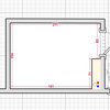
The colour we used was from the Dulux range - reference 05YY 42/727.
It is a fantastic colour but you don't need very much of it! And in this project it was used where the sun would fall on it directly at certain times of the day which totally transformed it.
If you are planning to use a strong colour like this I would suggest that you offset it against a neutral pallet of colours elsewhere. And if you use it like this, as a clearly defined feature block of colour, you can easily re-paint it at a later date to change the mood of the space completely.


peter nickels architects
hbarton011Автор