Houzz Logo Print
dcgdalton

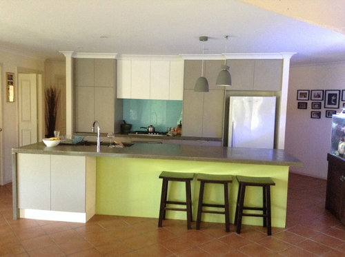
Kitchen island bench colour

Don CGD
Год(а)/Лет назад: 8
We are 90% finished with out kitchen Reno, but need to determine what colour to use on the front of the island bench. I had plans to put timber on the floor, but apparently now that is not an option, so I am stuck with the terracotta tile. The turquoise glass lash back is staying, but the avocado green has got to go. Should I use timber, or a block colour like white or charcoal?

Комментарии: 18

  • LouieT
    Год(а)/Лет назад: 8

    What about white may be best to marry with what you already have, I think another colour will break it up too much IMO. A mirrored glass finish could look good too but will give you an extra cleaning job. I think for cohesion you need to stay within the palette you have already so the bench/cupboards colour could be another option too.

  • PRO
    The Paint Makers
    Год(а)/Лет назад: 8

    Hi Don CGD,

    We have a wonderful selection of grey's to pick up the cupboards and help create a mix of muted tones, as you already have a couple of shades? Here is a link to our 'Cracked Path'; www.paintbyconran.com/en-GB/all-colours/m/product/view/45/preserve-elements

    Another two to check out are 'Dry Barley' and 'Sodden Clover'.

    We are Paint by Conran, a unique, luxury British paint range from Sir Terence Conran and his world renowned design company Conran and Partners... Check us out on Instagram for more inspiration @paintbyconran_

    Any other questions, I am more than happy to help! :)

    Thanks,

    Georgie x

  • jacquiw57
    Год(а)/Лет назад: 8

    jacqui

  • PAUL BERESFORD
    Год(а)/Лет назад: 8

    http://www.abet.com.au/a/Our-Products

    Take a look at these products they have some wonderfully different colours ,textures

    especially the christaline but you will need to send for samples as the web pics dont do them justice or we have a showroom in Willoughby,Sydney with samples

  • kooky_karen
    Год(а)/Лет назад: 8

    Continue with the white of the panel beside cupboards.

  • Andrew Bounader
    Год(а)/Лет назад: 8
    yes..
    the white or match the grey exactly - take a sample to a paint store - specialist and get them to run the colour match spectro over it to get it right.
  • User
    Год(а)/Лет назад: 8

    What are the colours and styles of the room the island is facing into?

  • julienewans
    Год(а)/Лет назад: 8

    If your stuck with the splash back I think white would be the best choice. At the moment you just look at that solid green (which would be the case what ever solid colour you chose) so by adding white to tie in the existing doors and trims it would allow the introduction of items that head along that turquoise theme (possibly some fabric cushions in the adjoining room to continue it through). Defiantly not timber, way too many elements.

  • PRO
    Kiwi Kitchens Ltd
    Год(а)/Лет назад: 8

    I would use the white of the cupboards above the hob area to give balance to the whole kitchen. If this is not the same as the white on the end of the cupboard under the breakfast bar, get a panel made to fit on the end of this cupboard to match the white of the backing panels. I don't think it is a good idea to introduce another colour or texture.

  • PRO
    Rebecca Naughtin Architect
    Год(а)/Лет назад: 8
    it seems that the consensus is white or dark grey, or to match the light fittings. personally, I'd go dark colour in the same hue to help hide the stools and also support the idea of a floating benchtop. all the best!
  • mrshortin
    Год(а)/Лет назад: 8

    I too would use the white of the cupboards, and paint the stools white, and put turquoise cushions on them.

  • deanli14
    Год(а)/Лет назад: 8

    I've noticed a recent trend of the vertical color on the island matching the vertical color on the splashback. Liking that trend. So I would say go with the turquoise glass splash back color. Deepen it a little so the hue is closer to that of the floor. Cant tell from pic whether island cupboards are the same color as cupboards above the splashback. If they are, all the better. That then brings the turquoise/white combo forward into the room and gives some unity.

  • rubixx
    Год(а)/Лет назад: 8
    White from your overhead cabinets. You have enough to greys already. The white will lighten up the space more.
  • PRO
    A & T Cabinet Makers
    Год(а)/Лет назад: 7

    White would look great and allow the bar stools to pop

  • girlguides
    Год(а)/Лет назад: 7
    Wow that photo is out there even for me
  • girlguides
    Год(а)/Лет назад: 7
    I'd go a deeper shade of turquoise with grey tinge. Blues look great against orange I'd also steer clear of wood as you have nice timber furniture and don't want a clash
  • asquithoatley
    Год(а)/Лет назад: 7

    Year old post! What did you end up doing , Don ?